Power Up - Upskill Yourself...
❌

Reading view

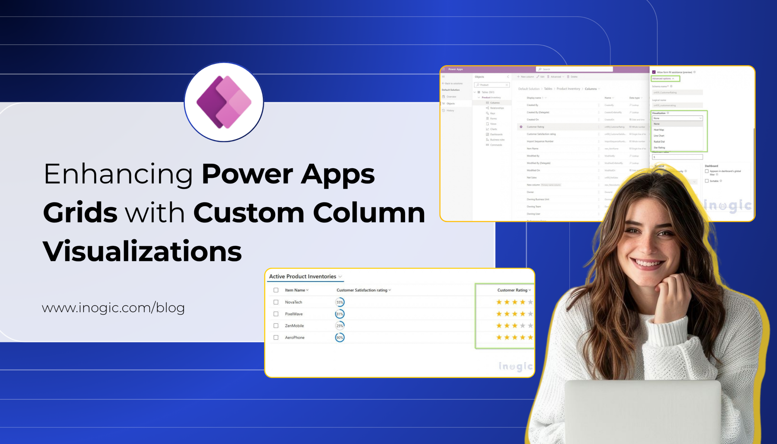
Enhancing Power Apps Grids with Custom Column Visualizations
Enhancing Power Apps Grids with Custom Column Visualizations

Displaying data in a Power Apps or Dataverse grid is one of the most common ways for users to work with business information. However, when a grid contains several numeric values, displaying everything as plain text can make it difficult to quickly understand and compare the data.

Key Takeaways

  • Custom Column Visualizations let grid columns display data as Radial Dials, Line Charts, Heat Maps, or Star Ratings instead of plain text. No PCF controls or web resources required.
  • Visualizations are configured directly on the column through Advanced Options, and once saved, apply automatically across every grid or view using that column.
  • Each visualization expects a specific data format (e.g., comma-separated numbers for Line Charts, whole numbers 0–100 for Radial Dial), so data preparation matters for accurate results.
  • This is currently a preview feature, so it should be evaluated carefully before being used in production environments.

PCF controls and web resources are still relevant for fully custom visualizations, but for common scenarios, this native option cuts out development, deployment, and maintenance work.

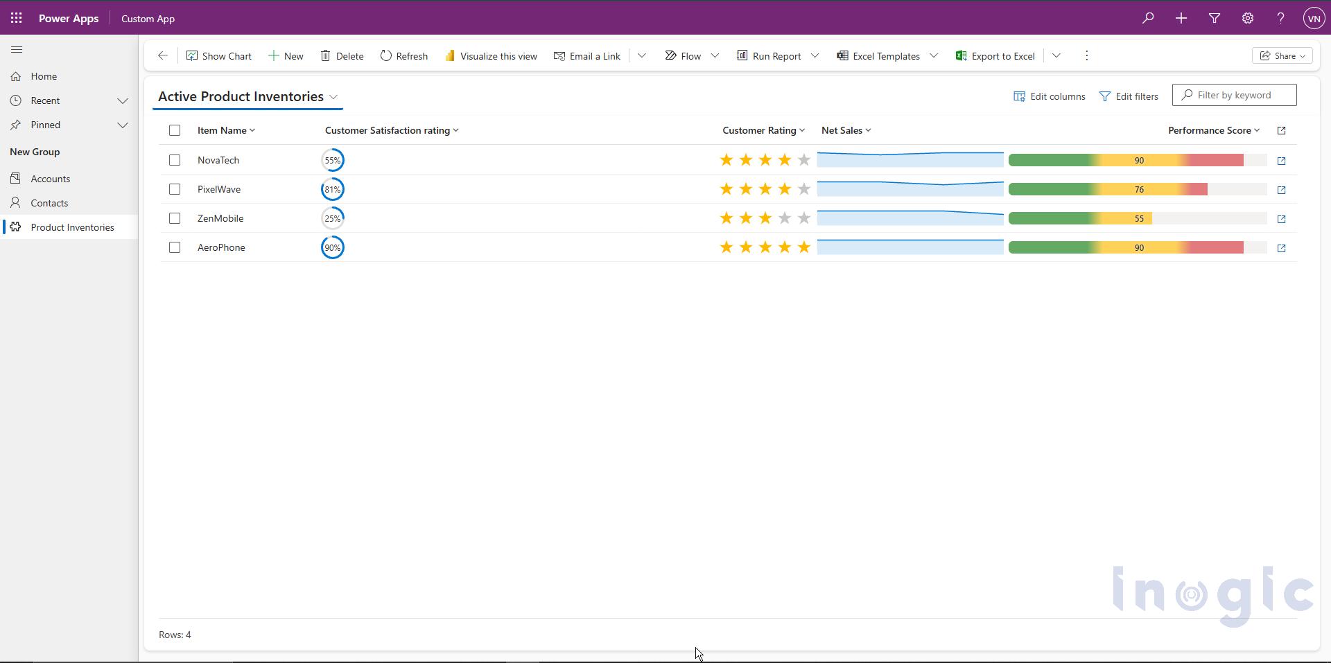
For example, consider a mobile phone company that uses Power Apps to track the sales and performance of its products. The company may have a table containing yearly sales data for its brands such as NovaTech, PixelWave, ZenMobile, and AeroPhone.

Product Q1 Sales Q2 Sales Q3 Sales Q4 Sales
NovaTech 200 80 350 520
PixelWave 75 300 321 487
ZenMobile 600 423 400 275
AeroPhone 391 391 700 846

Although the information is available, users need to read and compare the numbers manually to understand which products are performing better or how sales are changing over time.

Traditionally, organizations that wanted to provide a more visual experience inside a grid could use custom development approaches such as Power Apps Component Framework (PCF) controls or web resources. These approaches provide flexibility, but they also require additional development, deployment, and maintenance.

This is where Custom Column Visualizations for Grids can help.
Enhancing Power Apps Grids with Custom Column Visualizations

Custom Column Visualizations allow column values to be displayed as small graphics directly inside grid cells instead of plain text. With this capability, common visualization requirements can be handled through column configuration rather than requiring a custom PCF control or web resource.

The available visualization options are:

  • Radial Dial
  • Line Chart
  • Heat Map
  • Star Rating

The visualization is configured directly on the column. Once saved, any grid or view that displays that column automatically shows the selected visualization.

Note: Custom Column Visualizations for Grids is currently a preview feature and may change before becoming generally available.

From Custom Development to Native Visualization:

Before Custom Column Visualizations were available, organizations that wanted to display data graphically inside a grid could implement custom UI using PCF controls or web resources.

For example, if the bakery wanted to display its product sales as a visual indicator instead of showing only a number such as 780, a developer could create a custom PCF control or web resource to render the value graphically.

While these approaches provide flexibility, they can also introduce additional work:

  • Development and testing of custom code
  • Deployment through solutions
  • Maintenance when requirements change
  • Dependency on developer resources

Custom Column Visualizations provide a native alternative for the visualization types supported by Power Apps. Instead of developing a custom component for a supported visualization, an administrator can select the required visualization directly from the column properties.

Available Custom Column Visualizations:

Custom Column Visualizations provide four graphical display types, in addition to the standard text display.

Visualization Suitable for
Radial Dial Percentages and progress values
Line Chart Trends represented by multiple values
Heat Map Values within a defined range
Star Rating Ratings and scores

Each visualization expects the data to be stored in a specific format.

How to Configure a Custom Column Visualization:

Follow the steps below to configure a visualization for a column.

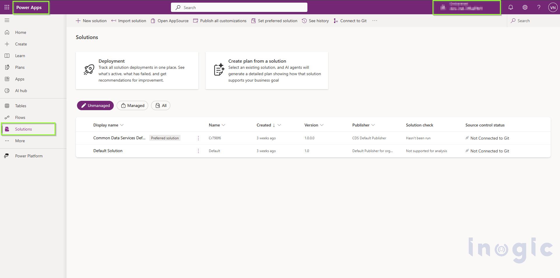
Step 1: Open Power Apps

Sign in to Power Apps and select the required environment.

From the left navigation pane, select Solutions.
Enhancing Power Apps Grids with Custom Column Visualizations

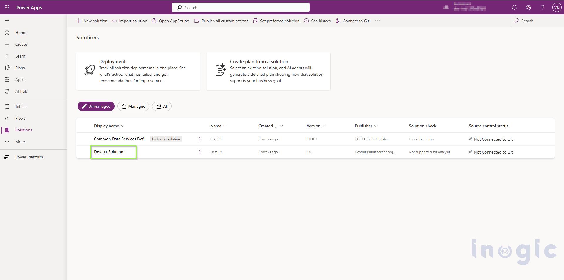
Step 2: Open the Required Solution

From the list of available solutions, open the solution that contains the table you want to modify.
Enhancing Power Apps Grids with Custom Column Visualizations

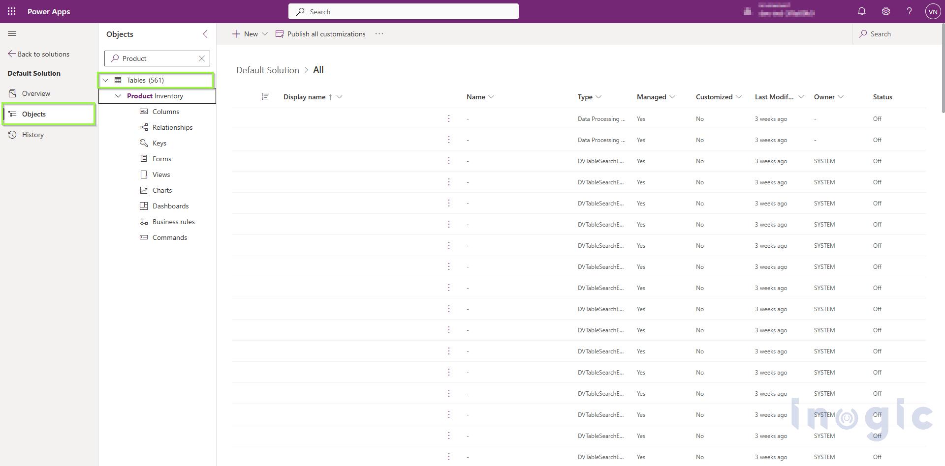
Step 3: Open the Table

Open the required table from the solution.
Enhancing Power Apps Grids with Custom Column Visualizations

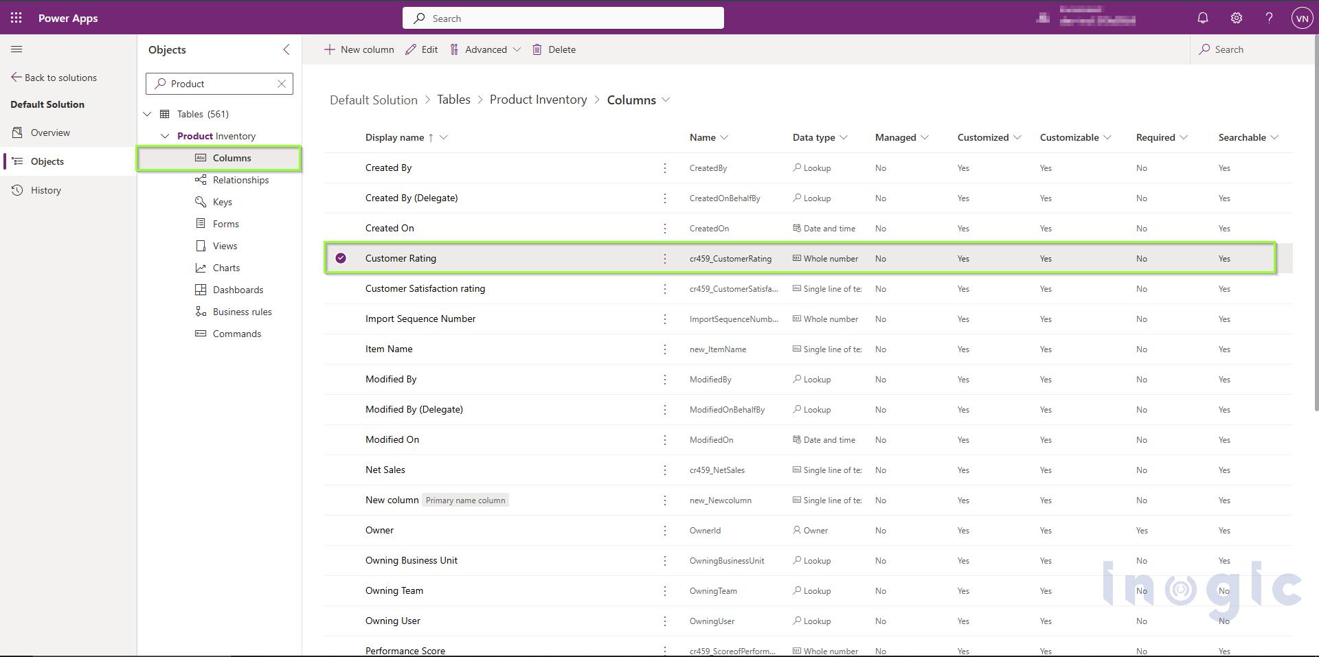
Step 4: Select the Column

From the table properties, select Columns to view the available columns.

Open the column for which you want to configure the visualization.

For this example, let’s open the Customer Rating column.
Enhancing Power Apps Grids with Custom Column Visualizations

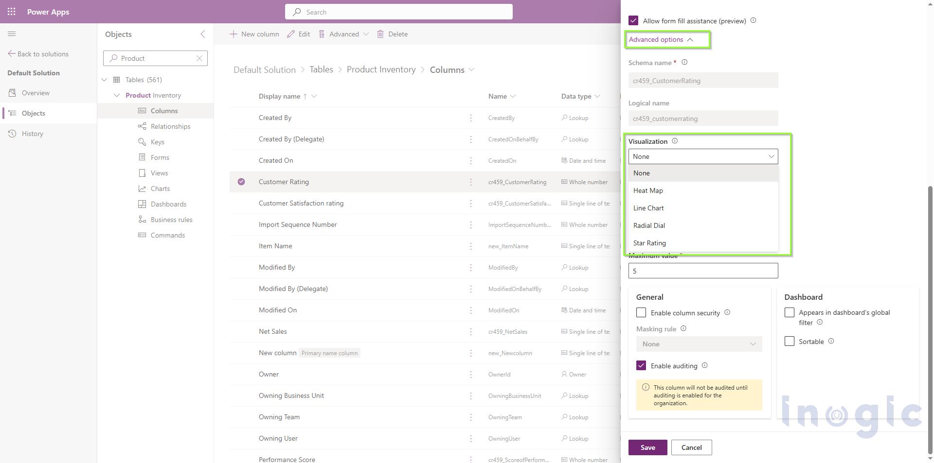
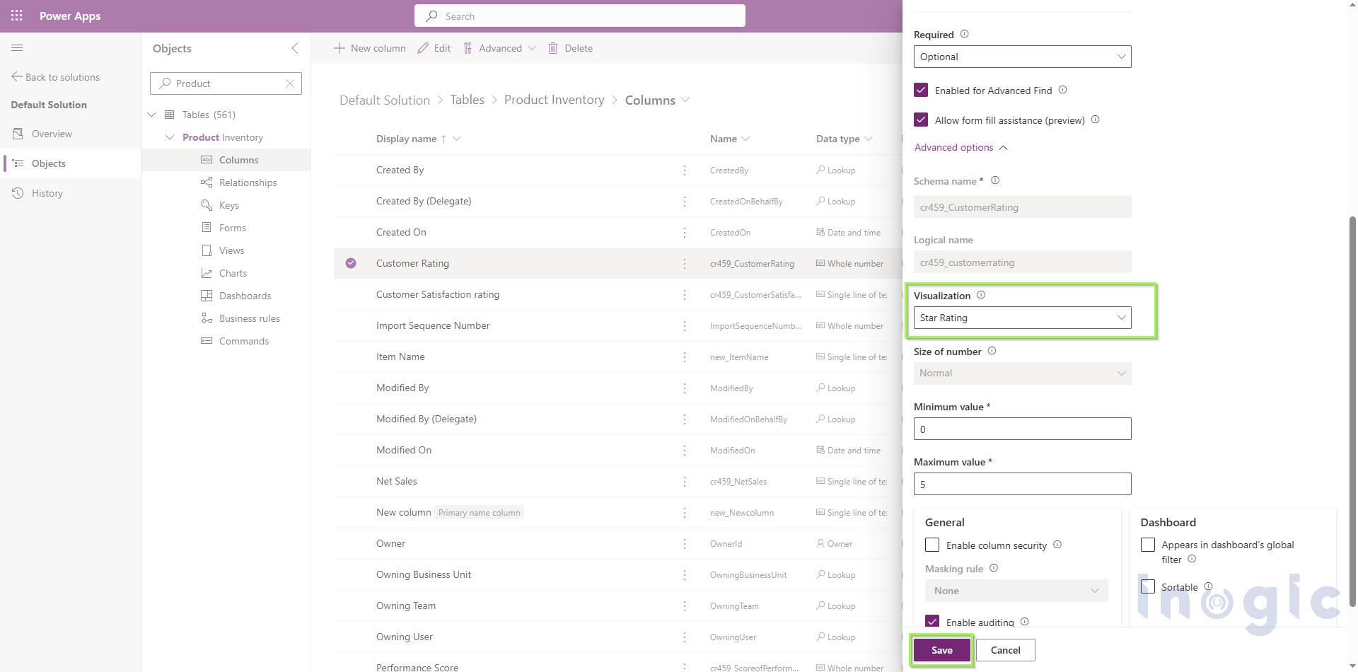
Step 5: Open Advanced Options

Expand Advanced Options in the column properties.

Locate the setting:

Choose how this column’s data will be visualized in the application

The available options are:

  • None
  • Heat Map
  • Line Chart
  • Radial Dial
  • Star Rating

Enhancing Power Apps Grids with Custom Column Visualizations

Step 6: Select the Visualization and Save the Column

Select the visualization you want to use.

For this example, let’s select Star Rating.

The Customer Rating column contains values on a 0–5 scale, making it suitable for Star Rating visualization.

Select Save to save the column configuration.
Enhancing Power Apps Grids with Custom Column Visualizations

After Using Custom Column Visualization:

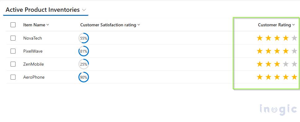
After applying the Star Rating, the same data is now represented visually.
Enhancing Power Apps Grids with Custom Column Visualizations

The underlying data has not changed. The same column values are being displayed; only the way those values are rendered in the grid has changed.

For this supported visualization scenario, there is no need to develop and deploy a separate PCF control or web resource simply to render the value as a radial dial.

Understanding the Available Visualizations:

1. Radial Dial:

The Radial Dial displays a single numeric value as a circular ring.

It is suitable for percentages or progress values on a 0–100 scale.

Example

Suppose the NovaTech’s Customer Satisfaction Rating column contains:

  • 45
  • 75
  • 90

After applying the Radial Dial, users can quickly see which product customers are more satisfied with. The visualization accepts whole numbers or decimals, and a trailing percentage sign is also supported.

Tip: If the intended value is 60%, store it as 60 rather than 0.6. A value of 0.6 is interpreted as 0.6%, not 60%.

2. Line Chart:

The Line Chart displays a small trend line inside the grid cell.

It is useful when a record needs to display a sequence of values and users need to understand whether the values are increasing, decreasing, or fluctuating.

Example

The mobile phone company wants to track the quarterly sales of its brands.

For this example, separate columns are created for each quarter:

  • Q1 Sales
  • Q2 Sales
  • Q3 Sales
  • Q4 Sales

For example, the sales data for NovaTech is:

  • Q1 Sales → 200
  • Q2 Sales → 86
  • Q3 Sales → 450
  • Q4 Sales → 900

A formula is then used to combine these four values into a single field in the required comma-separated format:

200, 86, 450, 900

The resulting field is then configured with the Line Chart visualization.

The Line Chart uses these values to display the quarterly sales trend directly within the grid, allowing users to quickly understand how sales changed from Q1 to Q4.

The Line Chart expects a text column containing multiple numbers separated by commas. At least two values are recommended to display a meaningful trend.

3. Heat Map

The Heat Map displays a value using a horizontal colored bar. The color changes depending on where the value falls within the defined range.

By default, the range is 0 to 100.

Example

The bakery can use a Product Performance Score column:

Product Performance Score
NovaTech 90
PixelWave 76
ZenMobile 55
AeroPhone 90

The Heat Map allows users to quickly identify products with higher or lower performance.

The Heat Map can also be used with choice columns. For choice columns, the underlying numerical value determines the visualization, so the choice values should be logically ordered.

4. Star Rating:

The Star Rating visualization displays a numeric value using stars.

By default, the visualization contains five stars.

Example

The mobile phone company may also maintain customer ratings for its products.

Product Customer Rating
NovaTech 4
PixelWave 4
ZenMobile 3
AeroPhone 5

Instead of displaying only the numbers, the values can be represented using stars.

The visualization expects a whole number from 0 up to the number of stars. Decimal values can also partially fill a star.

Data Preparation and Common Issues:

Custom Column Visualizations work correctly when the underlying column data matches the expected format.

Data Preparation:

  • Use numeric columns for Radial Dial, Heat Map, and Star Rating.
  • Use a text column containing comma-separated numbers for Line Chart.
  • Keep values clean and avoid unnecessary text, units, or formatting.
  • Make sure values are within the expected range.
  • Refresh the grid after changing the visualization.

For example, a Line Chart should contain:

450,620,780

rather than:

2023: 450, 2024: 620, 2025: 780

Common Issues:

The following issues may occur while implementing custom column visualization:

  • Radial Dial is full or empty:
    Check whether the value is outside the expected range or has been stored as a fraction.
  • Line Chart shows a single point:
    Check that the column contains multiple comma-separated values.
  • Line Chart contains gaps:
    Check for non-numeric values within the series.
  • Star Rating shows all stars:
    Values equal to or greater than the maximum number of stars will fill all stars.
  • Heat Map doesn’t show the expected order:
    For choice columns, check that the underlying numerical choice values are logically ordered.

Custom Visualization vs. PCF or Web Resource:

Custom Column Visualizations don’t replace PCFs or web resources in every scenario.

PCF controls and web resources remain useful when an organization requires a custom visualization or behavior that isn’t provided by the native options.

For example, if the bakery requires a completely custom interactive sales visualization with additional calculations or functionality, a PCF control may still be appropriate.

However, when the requirement is simply to display a supported visualization such as a Radial Dial, Line Chart, Heat Map, or Star Rating, Custom Column Visualizations provide a simpler configuration-based approach.

In simple terms:

Earlier approach

Requirement → Develop PCF/Web Resource → Test → Deploy → Maintain

Current approach

Requirement → Select Visualization → Save → Use in Grid

This reduces the amount of custom development required for common visualization scenarios.

Benefits of Custom Column Visualizations:

Custom Column Visualizations provide several benefits for organizations working with Power Apps and Dataverse grids.

  • Reduced custom development for supported visualization requirements.
  • Easier configuration directly from column properties.
  • Faster comparison of values across records.
  • Better grid experience without requiring users to open individual records.
  • Consistent visualization across grids and views using the column.
  • Reduced maintenance compared with custom solutions.

For the bakery, this means users can understand product sales and performance more quickly without relying only on plain numerical values.

FAQs

Q1: What are Custom Column Visualizations in Power Apps?
Custom Column Visualizations are a native way to display column values graphically inside a Power Apps or Dataverse grid, as a Radial Dial, Line Chart, Heat Map, or Star Rating, instead of showing plain numeric text.

Q2: Do I need a PCF control or web resource to use these visualizations?
No. For the four supported visualization types, you can configure them directly through the column’s Advanced Options, without writing, deploying, or maintaining any custom code.

Q3: What data format does each visualization require?
Radial Dial, Heat Map, and Star Rating expect numeric columns within a defined range (e.g., 0–100 for Radial Dial, 0–5 for a 5-star rating). Line Chart requires a text column containing comma-separated numeric values, such as 450,620,780, with at least two values recommended for a meaningful trend.

Q4: Why is my Radial Dial showing as full or empty?
This usually means the stored value is outside the expected range, or was entered as a fraction (e.g., 0.6) instead of a whole number (e.g., 60 for 60%).

Q5: Why is my Line Chart only showing a single point or has gaps in it?
A single point usually means the column doesn’t contain multiple comma-separated values. Gaps typically indicate non-numeric values mixed into the series.

Q6: Can Heat Map visualization be used with choice columns?
Yes. For choice columns, the visualization is based on the underlying numerical value of each choice, so the choice options need to be logically ordered for the Heat Map to display correctly.

Q7: Should I still use PCF controls if this feature is available?
Yes, in some cases. Custom Column Visualizations cover common scenarios well, but PCF controls or web resources are still the right choice when you need a fully custom visualization or interactive behavior beyond the four supported types.

Q8: Is this feature ready for production use?
Not yet guaranteed. Custom Column Visualizations for Grids is currently a preview feature and may change before general availability, so it should be evaluated and tested before relying on it in a production environment.

Conclusion:

Custom Column Visualizations provide a simple way to make Power Apps and Dataverse grids more informative and easier to understand.

Visualizations such as Line Charts, Radial Dials, Heat Maps, and Star Ratings can help users quickly compare and interpret different types of business data directly within a grid.

Previously, organizations could use PCF controls or web resources to introduce graphical representations inside their grids. These technologies remain useful for highly customized requirements, but they can involve additional development, deployment, and maintenance.

With Custom Column Visualizations, common visualization requirements can now be handled directly through column configuration without custom development.

By selecting the appropriate visualization and preparing the data in the required format, organizations can improve the grid experience while making business data easier to interpret.

Note: Custom Column Visualizations for Grids is currently a preview feature and should be evaluated accordingly before being used in production scenarios.

The post Enhancing Power Apps Grids with Custom Column Visualizations first appeared on Microsoft Dynamics 365 CRM Tips and Tricks.
  •  

Dynamics 365 CRM Visualization: How Visual Tools Help Teams Understand Data Faster

Dynamics 365 CRM Visualization: How Visual Tools Help Teams Understand Data Faster

Microsoft Dynamics 365 CRM stores valuable customer, sales, and service data. As organizations grow, that data becomes increasingly interconnected across Accounts, Contacts, Opportunities, Cases, activities, and custom entities. While the information is available, understanding it often isn’t easy. Users switch between grids, forms, subgrids, and multiple tabs to track workflow progress or understand customer relationships.

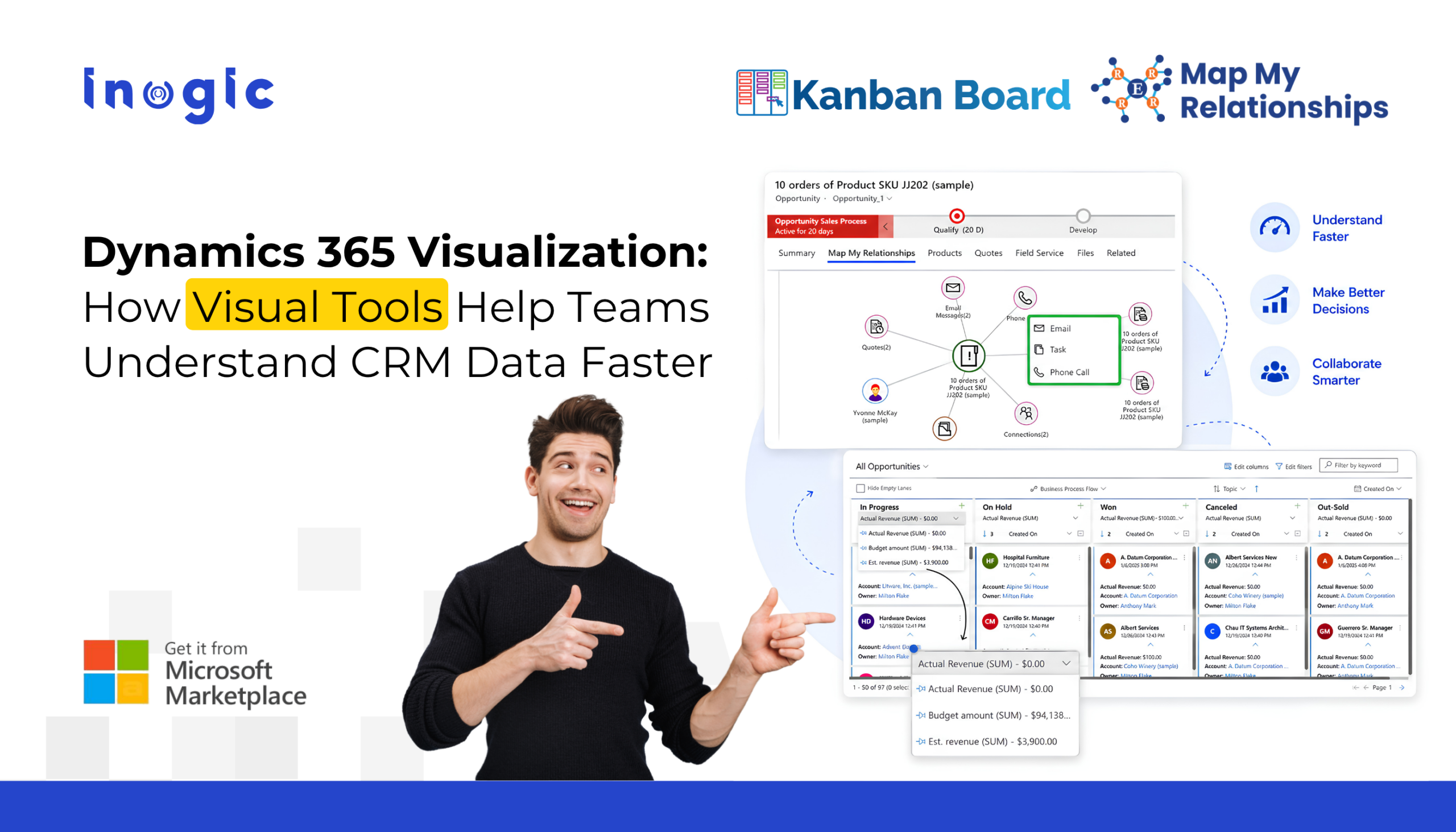
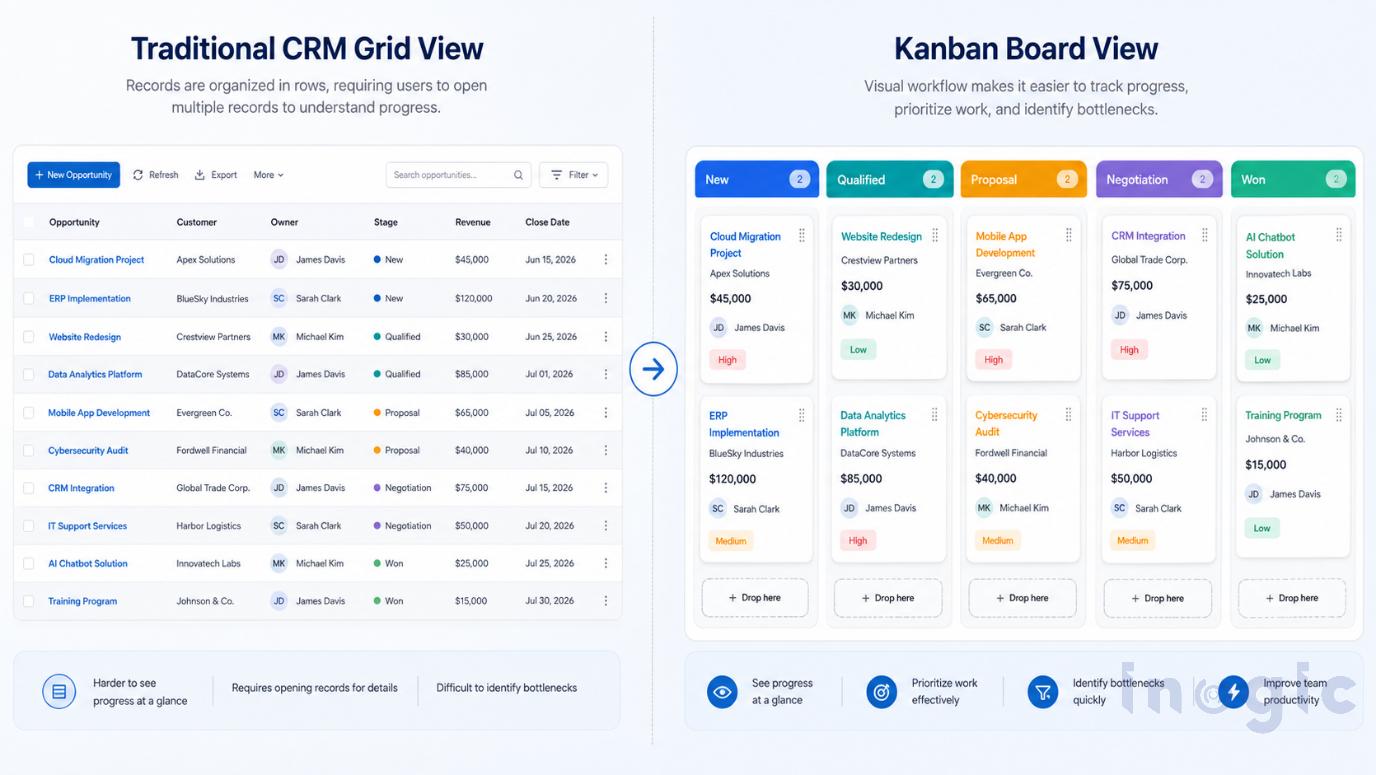
Dynamics 365 CRM Visualization: How Visual Tools Help Teams Understand Data FasterThis is where Dynamics 365 CRM visualization makes a difference. Instead of presenting information as rows of data, visualization tools display records as boards, maps, and hierarchies that are easier to interpret and act on. Whether you’re using customer relationship management software to manage sales or improve CRM relationship management, visual interfaces help teams understand information faster. Solutions like Kanban Board and Map My Relationships take different approaches to CRM visualization, helping organizations improve business relationship management and make better decisions.

Key Takeaways

  • Dynamics 365 CRM visualization transforms traditional CRM data into visual boards, maps, and hierarchies, making it easier to understand and act on.
  • Kanban Board Dynamics 365 CRM helps teams visualize workflows, track pipelines, and manage tasks more efficiently with an interactive Kanban View Dynamics 365.
  • Map My Relationships enhances customer relationship visualization by displaying Dynamics 365 relationships through Mind Map View, Tree View, and Hierarchy Control.
  • Combining workflow visualization and customer relationship mapping enables faster decision-making, better collaboration, and improved CRM relationship management.
  • Visual CRM tools support both standard and custom entities, helping sales, service, account management, and CRM teams work smarter within Microsoft Dynamics 365 CRM.

Dynamics 365 CRM Visualization: How Visual Tools Help Teams Understand Data FasterWhat Is CRM Visualization in Dynamics 365?

CRM visualization is the practice of presenting CRM data in visual formats such as Kanban Boards, Mind Maps, Hierarchy Views, dashboards, and charts. Rather than navigating multiple records individually, users can quickly understand workflows, customer relationships, and business structures from a single interface.

Traditional CRM views are designed for data entry and record management, but they often make it difficult to see the bigger picture. Visual interfaces reduce navigation, improve context, and help users make faster, more informed decisions. Whether the objective is customer relationship mapping, or workflow tracking, presenting information visually enables users to interpret data with greater clarity.

Why CRM Visualization Matters

The value of CRM lies in how quickly users can understand and act on information. Visual layouts reduce the effort required to locate related records, identify priorities, and interpret complex business data. This improves productivity, encourages CRM adoption, and enables better collaboration between sales, service, and account management teams.

For organizations focused on stakeholder relationship management, visual CRM interfaces make it easier to understand reporting structures, customer hierarchies, and business connections without switching between multiple records.

Visualizing Workflow with Kanban Board

Workflow visualization answers one simple question: Where does my work stand?

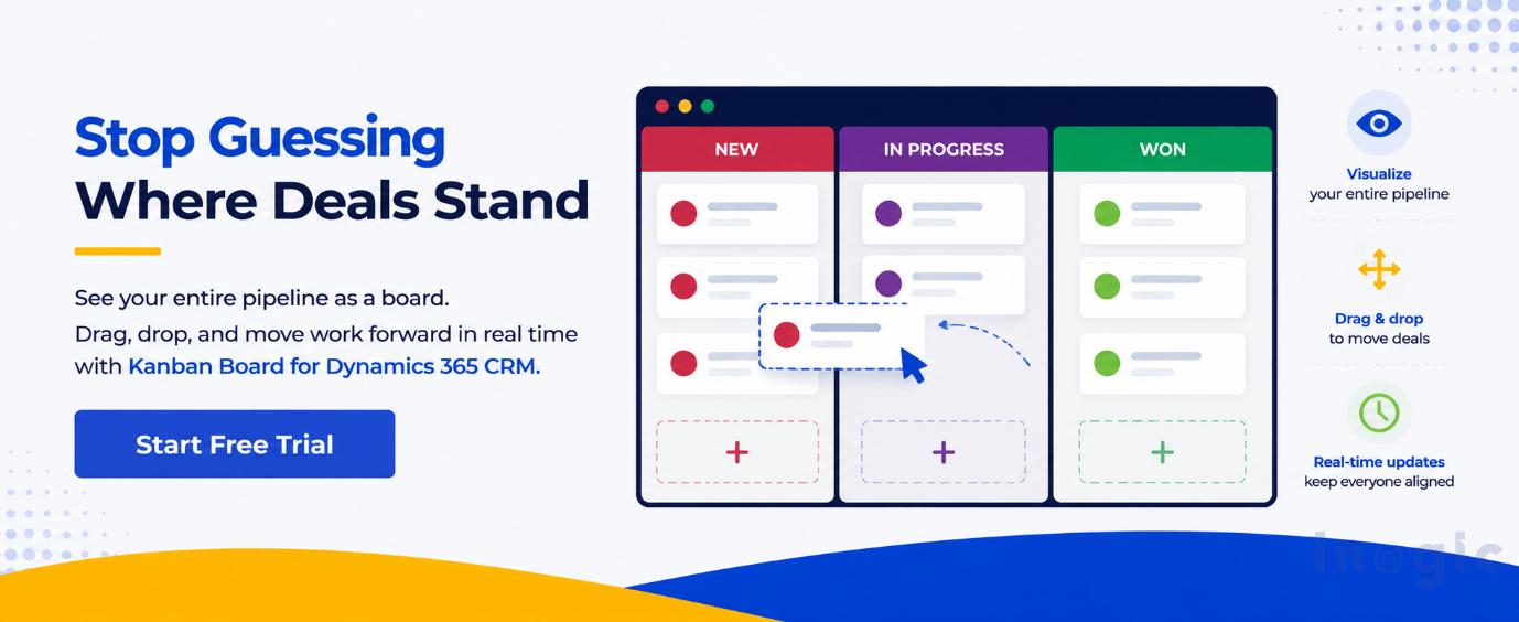
Instead of displaying Opportunities, Leads, or Cases in rows, Kanban Board Dynamics 365 CRM organizes records as visual cards grouped by stages. Users can quickly identify stalled opportunities, overloaded stages, or high-priority work. With drag-and-drop functionality, Kanban View Dynamics 365 CRM allows teams to update records and move them through the pipeline without opening multiple forms.

Whether you refer to it as Kanban Dynamics CRM, interface, this visual approach is particularly useful for:

  • Sales pipeline management
  • Lead qualification
  • Opportunity tracking
  • Service request management
  • Project and task monitoring

By presenting workflow visually, Kanban Board Dynamics 365 helps teams spend less time navigating CRM and more time moving work forward.

Visualizing Relationships with Map My Relationships

Dynamics 365 CRM Visualization: How Visual Tools Help Teams Understand Data FasterWorkflow visibility is only part of the story. Understanding Dynamics 365 relationships is equally important.

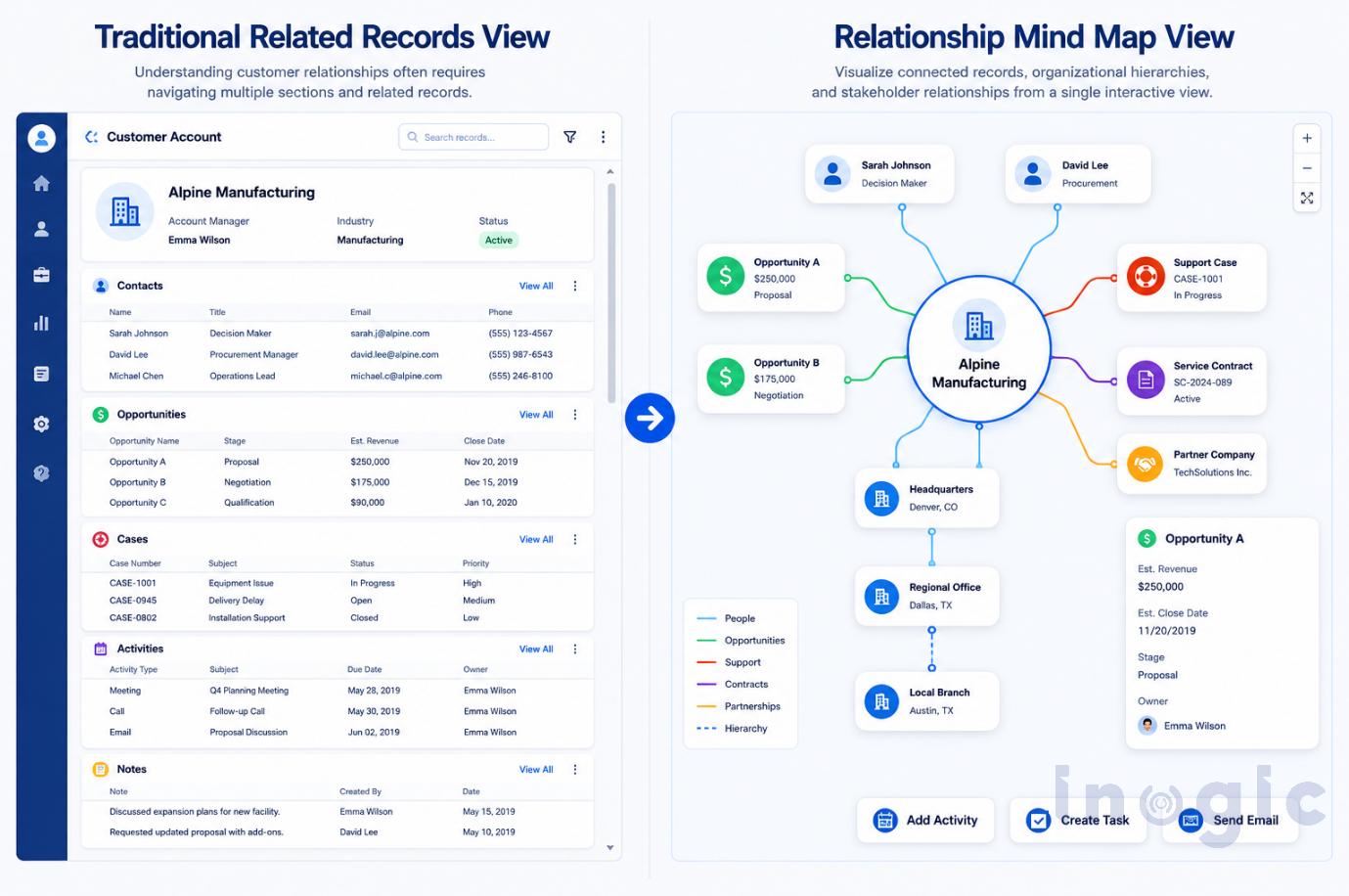
Map My Relationships transforms related CRM records into interactive Mind Map Dynamics 365, Tree View, and Hierarchy Control experiences. Instead of opening multiple records to understand an account structure, users can visualize, explore connected entities, and view organizational hierarchies from a single screen.

Dynamics 365 CRM Visualization: How Visual Tools Help Teams Understand Data FasterThis visual relationship management tool is especially valuable for:

  • Enterprise account planning
  • Stakeholder identification
  • Buying committee analysis
  • Organizational hierarchy visualization
  • Customer relationship mapping

Organizations looking for relationship mapping software can use these visual interfaces to better understand customer ecosystems, strengthen business relationship management, and improve collaboration across teams. A relationship graph Dynamics 365 provides greater context than traditional record views, while an interactive Dynamics 365 relationship view helps users navigate complex customer structures more efficiently.

Kanban View vs. Mind Map View

Feature Kanban Board Map My Relationships
Best for Workflow visualization Relationship visualization
Shows Process stages Connected records
Ideal users Sales, Service teams Sales, Account Managers
Visualization Cards Mind Map & Hierarchy
Main purpose Track work progress Understand customer connections

Rather than replacing one another, these visualization methods complement each other. One shows how work progresses, while the other helps to visualize relationships between customers, stakeholders, and business entities.

Choosing the Right Visualization for Your CRM

Choose Kanban View Dynamics 365 when your priority is managing workflows, tracking pipelines, and improving process visibility. Choose Map My Relationships when understanding customer hierarchies, stakeholder networks, and connected records is more important.

Organizations that use both gain a more complete view of their CRM by combining workflow visualization with customer relationship visualization, enabling faster decisions and better collaboration.

Business Benefits of CRM Visualization

Whether you’re managing sales, service, or customer accounts, visual CRM interfaces help you:

  • Make faster decisions with clearer business context.
  • Reduce time spent searching across records.
  • Improve collaboration between teams.
  • Better understand customers and organizational structures.
  • Increase user adoption through intuitive visual experiences.
  • Strengthen CRM relationship management by making customer connections easier to understand.

Conclusion

As CRM environments become more complex, simply storing data is no longer enough. Dynamics 365 CRM visualization helps teams understand information faster, make better decisions, and work more efficiently.

While Kanban Board brings clarity to workflows, Map My Relationships makes customer relationships and hierarchies easier to visualize. Together, they deliver a more intuitive Dynamics 365 CRM experience.

At Inogic, we help organizations maximize the value of Dynamics 365 CRM with productivity solutions built for real business needs. Explore Kanban Board and Map My Relationships to transform the way your teams visualize, manage, and act on CRM data.

Frequently Asked Questions

1. What is CRM relationship management in Dynamics 365?

CRM relationship management is the process of managing interactions and connections with customers using customer relationship management software. In Dynamics 365, visualization tools help users understand these relationships through intuitive boards, maps, and hierarchies.

2. What is customer relationship mapping?

Customer relationship mapping is the practice of visually displaying how customers, contacts, accounts, opportunities, and other records are connected. A relationship mapping software solution helps teams understand these connections without navigating multiple CRM records.

3. What is the difference between Kanban View Dynamics 365 and Mind Map Dynamics 365?

Kanban View Dynamics 365 focuses on workflow and process visualization using visual cards grouped by stages, while Mind Map Dynamics 365 focuses on Dynamics 365 relationships, allowing users to visualize customer hierarchies, stakeholders, and connected records.

4. How does a relationship graph in Dynamics 365 improve productivity?

A Dynamics 365 relationship view provides a visual representation of connected records, helping users quickly identify stakeholders, account hierarchies, and business relationships for faster decision-making.

5. Which visualization is better for sales teams?

Sales teams benefit from both approaches. Kanban Board Dynamics 365 CRM is ideal for managing pipelines and opportunities, while Map My Relationships helps visualize Dynamics 365 relationship maps, identify decision-makers, and support stakeholder relationship management.

6. Can CRM visualization tools work with standard and custom entities?

Yes. Both Kanban Dynamics 365 and Map My Relationships support standard and custom entities, making them flexible visualization and relationship management software solutions for organizations with customized Dynamics 365 CRM environments.

The post Dynamics 365 CRM Visualization: How Visual Tools Help Teams Understand Data Faster first appeared on Microsoft Dynamics 365 CRM Tips and Tricks.

  •  

My AB‑730 Certification Experience: How I Prepared, What I Learned, and Tips for You

Clearing the AB‑730: AI Business Professional certification has been one of the most rewarding learning experiences in my AI journey. This exam is designed for professionals who want to understand how to use Microsoft Copilot, Agentic AI, and AI‑driven business workflows to solve real‑world problems.

In this post, I’m sharing my preparation path, key takeaways, and practical tips that will help anyone planning to take AB‑730.

Why I Chose AB‑730:

As someone deeply involved in Microsoft 365, Power Platform, and AI‑driven productivity, AB‑730 felt like the perfect certification to validate my skills. It focuses on:

  • Applying Copilot in day‑to‑day business scenarios
  • Understanding AI capabilities across Microsoft 365
  • Choosing the right Copilot for the right task
  • Improving workflows using AI reasoning and orchestration

It’s not a technical exam – it’s about practical AI usage, decision‑making, and business impact.

My Preparation Path

I followed the official Microsoft Learn certification path, which is more than enough to prepare you thoroughly. The learning modules are structured, scenario‑based, and aligned directly with the exam.

What I used:

  • Microsoft Learn AB‑730 learning path
  • Microsoft AB 730 free Practice Assessment (which has 50 questions)
  • Hands‑on practice with Microsoft 365 Copilot
  • Real business scenarios from my daily work

The Learn modules helped me understand the concepts, but the real confidence came from using Copilot in real workflows – writing emails, analyzing data, summarizing documents, and automating tasks.

AB 730 and AB 731 Certification Course completed on Technofocus | Skill Up with Level Up with a Test. This helped me a lot to gain more knowledge on the exam.

For revision I followed the below YouTube video,

AB-730 Microsoft AI Business Professional Exam Revision Guide

What the Exam Felt Like

The exam focuses on practical understanding, not memorization. Expect questions around:

  • Choosing the right Copilot (M365 Copilot, Copilot Studio, Copilot Chat, etc.)
  • Identifying the best AI capability for a scenario
  • Understanding how AI reasoning improves business workflows
  • Recognizing governance and responsible AI considerations
  • Applying Copilot to solve business problems

If you’ve used Copilot in real scenarios, the exam feels intuitive.

My Key Takeaways

1. Copilot is more than a chatbot

The exam emphasizes Copilot as a reasoning engine that can analyze, summarize, generate, and orchestrate tasks.

2. Business context matters

Many questions test whether you can choose the right Copilot for the right scenario.

3. Governance and responsible AI are essential

Even though AB‑730 is business‑focused, you still need to understand the basics of data boundaries, safety, and compliance.

4. Real usage beats theory

Using Copilot daily helped me answer scenario questions confidently.

Tips for Anyone Preparing

Here’s what I wish I knew earlier:

  • Complete the Microsoft Learn path end‑to‑end — it covers everything.
  • Practice using Copilot in Word, Excel, Outlook, Teams, and Edge.
  • Focus on scenarios, not definitions.
  • Understand the differences between Copilot types (M365 Copilot, Copilot Studio, Copilot Chat, etc.).
  • Review governance basics – data access, boundaries, and responsible AI.
  • Don’t overthink – the exam is practical and straightforward.

Final Thoughts

AB‑730 is a fantastic certification for anyone who wants to become an AI‑empowered business professional. It validates your ability to use Copilot effectively, make informed decisions, and drive AI adoption in your organization.

If you’re already using Microsoft 365 Copilot or planning to, this certification is absolutely worth it.

Also, if you had not enrolled for the free certification voucher for this exam. Follow the below article and complete the course it before 31st May 2026.

LevelUp Microsoft Exam Vouchers: Eligibility & Rules (May 2026)

Hope you had liked this article about AB 730 Certification.

Please like and share your valuable feedback on this article. Also, follow my blog to get my articles to your Inbox.

Graphic promoting a YouTube channel with the text 'Has my blog post helped you?' and buttons for 'WATCH', 'LEARN', and 'SUBSCRIBE'.

Below are my earlier articles that you can have a look.

LevelUp Microsoft Exam Vouchers: Eligibility & Rules (May 2026)

Explore Dataverse Tools: FetchXML Formatter Online by Arun Potti – JavaScript (JS) Example

Microsoft’s New AI Certifications for 2026: Full List, Retirements, and Replacement Paths

Boost Your CRM Productivity with Arun Potti’s FetchXML Formatter

Streamline FetchXML with Online Formatter for Dataverse Tools

Fixing Postman Connection Issues: A Step-by-Step Guide

Explore Microsoft AB-Series Certification: Skills for AI Roles

My first XRMToolBox Plugin: Dataverse Users, Security roles, Teams and Teams security roles

My first XRMToolBox Plugin: Dataverse Users, Security roles, Teams and Teams security roles (Usage)

My first XRMToolBox Plugin: Dataverse Users, Security roles, Teams and Teams security roles (Installation)

My first XRMToolBox Plugin: Dataverse Users, Security roles, Teams and Teams security roles (Overview)

Limited Time Offer: 50% Off Microsoft Certification Vouchers

How to send an automated email in Dataverse using Power Automate?

Understanding Activity Party Types in Dynamics 365 CE

How to configure donotreply email using Shared mailboxes in Dynamics 365 CE?

Microsoft Power Pages: The authentication key for your portal will expire

Microsoft Azure: You’re not eligible for an Azure free account

How to create Microsoft Azure 30 days trial?

Edit in Visual Studio Code for the Web in Power Apps Portals

Error: The object cannot be updated because it is read-only in Microsoft Power Apps

Resolved: Fix connections issue in Power Automate Flow

Clear all objects feature in Power Apps Solutions

Power Automate Error: The ‘inputs.parameters’ of workflow operation of type ‘OpenApiConnection’ is not valid.

Power Automate Error: To use FilteringAttributes, your trigger must include an Update event on Dataverse Trigger

Dynamics 365 CE Solution Import Failed in Azure DevOps Pipelines

Power Automate Error: Cannot write more bytes to the buffer than the configured maximum buffer size: 104857600

Error while opening a Tool in XRMToolBox

The Power Automate Cloud Flows Best Practices Whitepaper is now LIVE!

Error in Power Automate: There’s a problem that needs to be fixed to trigger this flow. To see more details, open Flow checker.

How to get the Dataverse Table’s first row from List Rows in Power Automate?

Microsoft Dataverse Accelerator – Part 2 – Installation

Microsoft Dataverse Accelerator – Part 1 – Introduction

How to get the Database Version of the Dataverse?

API playground feature not available in Dataverse Accelerator App?

How to Explore and test Dataverse in the Web API playground (preview)?

Web resource method does not exist in Dynamics 365 CE

How to get Environment Variable Value in Dynamics 365 CE using JavaScript?

Model-driven Apps – openAlertDialog – JavaScript – Code Snippet

Power Automate – Flow is not running on Trigger condition

Power Automate – Input field Delete option is disabled

Recipient of type ‘Contact’ with ID is marked as non-emailable

Preferred Solution | New feature | Microsoft Dataverse

New and Retired Microsoft Dynamics 365 Certifications

Environment settings behavior (Preview) feature in Model-driven Apps

Error while connecting to Dataverse environment in XrmToolBox

Power Fx Formula Columns in Microsoft Power Apps

How to Enable 2024 Release Wave 1 Updates in the Microsoft Dynamics 365 CE Environment?

Delete and Restore records (Preview) feature in Microsoft Dataverse

Microsoft Power App Environments Retention Period

How to Override the Model-driven app header colors?

Timeline Highlights (New feature) in Microsoft Power Apps

Model-driven App – Cannot “See associate records” option in the sub grid (arunpotti.com)

Bookmark the Important Dynamics 365 URLs

How to Enable Tenant-level analytics for Power Automate and Power Apps?

Microsoft Power Automate Copy and Paste Action in New DesignerHow to Setup Multi-Factor Authentication for your Microsoft Power Apps environment?

Microsoft Power Apps | Modern Themes | Preview feature

How to Download and Install the .NET Framework?

How to Create a SharePoint Site Online?

How to add and use Copilot answer control (Preview) in Microsoft Power Apps?

Dark Mode in Microsoft Power Apps

How to create Microsoft 365 E3 Trial for 30 days?

Refreshed look of solution dependencies in Dataverse Solutions

Microsoft Power Automate | Version History | Restore | New Feature

MICROSOFT LEARN – Artificial Intelligence Skills Challenge​ 2024!!!

Resolved – ‘InvokerConnectionOverrideFailed’ Error When a Power App Custom Page call a Power Automate Flow

How to Create Microsoft Power Apps Trial 30 days?

Not able to Create Power Automate Flow in Custom Page in Model-Driven App?

How to Enable Inline Actions feature in Microsoft Canvas Apps?

How to use /mention in Outlook web client for Dataverse records?

Associate Activities Multiple Related Records (Preview) feature in Microsoft Dynamics 365 CE

How to Enable Aggregation (preview) feature in Microsoft Power Apps?

Power Apps – Some components of this app require you to sign in. If you don’t sign in, part of the app may not work.

How to Enable the SQL Server stored procedures (preview) feature in the Power Apps?

How to get the Client Version of the Model Driven Apps?

How to get Microsoft 365 E3 Trial for 30 days?

How to Enable Copilot for Model-Driven apps feature in Dynamics 365 CE Environment?

[Resolved] Web resource method does not exist in Dynamics 365 CE JavaScript Error

How to Enable Blocking unmanaged customizations (Preview) feature in Dynamics 365 CE?

How to create Microsoft Power Apps Developer Plan Environment?

Microsoft Power Apps Developer Plan vs Power Apps Trial 30 days

What is Microsoft Power Apps Developer Plan?

[Resolved] PCF Field Control not showing anything in the PCF Test Environment?

[Issue Resolved] ReferenceError: Web resource method does not exist in Dynamics 365 CE Javascript Error

[Issue Resolved] Subcomponent cannot be added to the solution because the root component Template is missing in Dataverse

How to Turn Off the Modern Look in the Model Driven Apps?

How to Turn on the New modern, refreshed look for the Model-Driven apps?

Microsoft Power Apps – Apps filter feature

How to Create Microsoft Power Apps 30 days Online Trial Version and an Environment?

Microsoft Power Apps – Solutions filter Preview feature

How to Show the Power Automate complete Expressions?

Dataverse Error: Cannot start the requested operation [EntityCustomization] because there is another [PublishAll] running at this moment.

Power Automate Error: You should specify a contact or account.

How to get the Choice Text and Value in the Dataverse using JavaScript?

Microsoft Dataverse Low Code No Code Plugins

How to convert the Number String to Number Array?

How to Integrate Instant Plugins in the Power Automate Flow?

Power Apps – ‘actionname’ is an unknown or unsupported function in namespace ‘Environment’

Dataverse Browser V1.1.0.1 is available for Dataverse Plugin Debugging

How to Integrate Instant Plugins in the Canvas App?

How to Enable Access to Microsoft Dataverse Actions (Preview feature) in the Power Apps?

How to Create an Instant Plugin in the Dataverse Environment?

How to Install the Microsoft Dataverse Accelerator in the Dataverse Environment?

What is Microsoft Dataverse Accelerator?

How to get the Logged in User Information in the Power Apps?

How to Install Power Platform Tools in Visual Studio Code?

How to Install the Apps from the Microsoft AppSource to your Dataverse Environment?

Microsoft Power Apps Maker Portal has a new look

Microsoft Power Apps Emulator (New Feature)

How to Enable the Dataverse Offline (Experimental Feature) in the Canvas Apps?

How to set the Authoring Version in the Canvas App?

New version of Dataverse Browser is available for Dataverse Plugin Debugging

Latest Free Practice Assessments for Microsoft Certifications

Download CRM 365 V9.X Tools using PowerShell

How to set the Refresh cadence for a Power Platform Environment?

Update forms and views (Preview feature) in Dataverse

How to connect to Microsoft Dataverse in Power Automate Flow using Service principal?

How to Enable Copilot (Preview) feature in Canvas Apps?

How to Debug a Dataverse Plugin without Installing the Profiler in the Plugin Registration Tool?

How to Enable the Licenses (Preview) feature for a Power Platform Environment?

How to Enable Maker Welcome Content (preview) in Power Apps Maker Portal?

How to Enable Managed Environments for a Dataverse Environment?

How to Enable the Modern Controls (Preview feature) in the Canvas Apps?

How to Enable 2023 Release Wave 1 updates in the Dataverse Environment?

How to Deploy Enterprise Applications in the new Dataverse Environment?

What is Preview, Experimental and Retired features in Canvas Apps?

How to Enable the New Power Fx Formula Bar in Power Apps Studio?

Writing Power Fx formulas with natural language

Power Fx Formula Columns in Dataverse

Generating Power Fx formulas from examples

How to Create Dynamics 365 Marketing 30 Days Trial Version Online?

How to disable Multi-Factor Authentication (MFA) on Dynamics 365 Login?

How to Create Microsoft Power Apps 30 days Online Trial Version and an Environment?

  •  

AI-Assisted Canvas App Development Using External Tools in Power Apps

Canvas AppCanvas apps have always been known for rapid development using a low-code, drag-and-drop approach. However, even with this speed, developers still spend a significant amount of time on repetitive UI building, writing Power Fx formulas, and refining logic manually.
Microsoft has recently introduced support for external AI-powered development tools for Canvas Apps. This allows developers and business users to work with AI-assisted tooling outside the traditional Power Apps Studio experience. Using external tools such as GitHub Copilot, AI agents, and Power Platform skills, users can now generate Canvas App structures, layouts, and workflows using natural language prompts.

This blog explores the setup experience, the architectural shift introduced by these tools, and most importantly how AI-assisted Canvas App generation can significantly accelerate development and provide a strong starting point for projects.

Key Takeaways

  • Generate Canvas Apps using natural language prompts with external AI-powered tools.
  • AI agents can automatically create screens, navigation, and basic app logic.
  • Reduce manual setup and accelerate development with GitHub Copilot and Power Platform skills.
  • Sync generated changes directly to live Canvas Apps through coauthoring.
  • Ideal for rapid prototyping and app scaffolding, while complex logic still requires developer expertise.

Overview

The introduction of external AI tooling for Canvas Apps represents a major change in the Power Platform ecosystem. Instead of relying completely on drag-and-drop development inside the browser, users can now interact with AI agents capable of understanding application requirements and generating app structures automatically.

The workflow combines:

  • GitHub Copilot and AI-assisted coding tools
  • Power Platform skills and AI agents
  • Local CLI-based tooling
  • Canvas App source generation
  • Natural language prompts

This creates a development experience that feels closer to modern software engineering workflows rather than traditional low-code configuration.

One of the most interesting aspects of this approach is that the AI system is no longer behaving like a simple chatbot. Instead, it works through

specialized agents such as:

  • canvas-app-planner
  • canvas-screen-builder

These agents understand specific Power Platform concepts and can generate app scaffolding, screen layouts, navigation structures, and other components based on user instructions.

Prerequisites and Setup

Before working with external AI tools for Canvas Apps, several prerequisites must be configured locally.

Required Tools

The following components are required:

  • .NET SDK 10+
  • GitHub CLI
  • Git installation
  • Power Platform CLI
  • GitHub Copilot access
  • Power Apps environment access

These tools provide the local runtime, authentication, AI integration, and Power Platform connectivity required for AI-assisted Canvas App generation.

You also need to have Environment ID and Canvas App ID (if you need to modify in an existing app).

Installing the Power Platform Skills Plugin

To enable Canvas App generation capabilities, the Power Platform Skills marketplace plugin must be installed.

The following commands can be executed using either:

  • Copilot CLI
  • Claude Code

Step 1 – Add the Power Platform Skills Marketplace

/plugin marketplace add microsoft/power-platform-skills

Step 2 – Install the Canvas Apps Plugin

/plugin install canvas-apps@power-platform-skills

After installation, restart the CLI session to load the newly added skills:

/restart

Once restarted, the environment exposes specialized AI agents and skills capable of assisting with Canvas App generation and screen creation.

Enabling Coauthoring for Canvas Apps

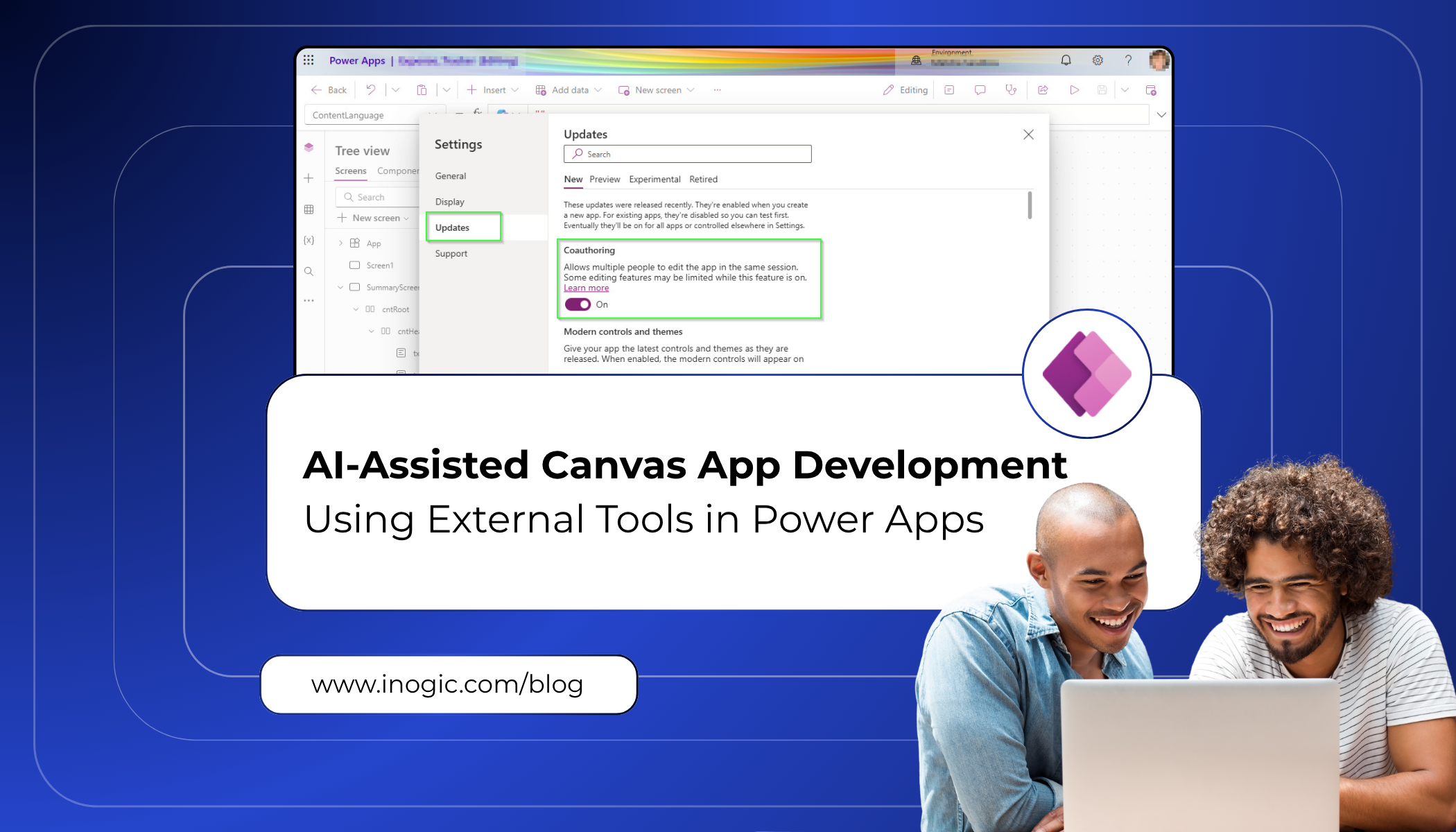
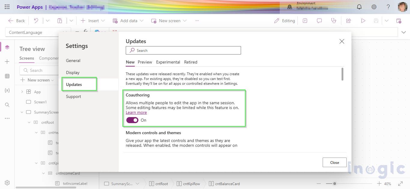
To use AI-assisted capabilities with Canvas Apps, coauthoring must be enabled for the application.

This can be configured inside Power Apps Studio:

Power Apps Studio

→ Settings

→ Updates

→ Enable Coauthoring

Canvas App

Without coauthoring enabled, the AI tooling cannot properly interact with the Canvas App source.

Connecting to the Power Platform Environment

Before generating apps, authentication with the target Power Platform environment is required.

Run the following command:

pac auth create –environment <your_environment_url>

This establishes the connection between the AI tooling and the Power Platform environment.

The environment ID is also required so the AI agents can correctly identify the target instance during app generation.

Initializing the Canvas App AI Workflow

Once the setup is complete, the Canvas App workflow can be initialized using:

/canvas-apps:canvas-app

This configures the MCP server connection and prepares the environment for AI-assisted Canvas App creation.

After initialization, users can begin generating app structures, screens, and workflows using natural language prompts.

Implementation

Instead of starting with a blank canvas and designing every screen from scratch, you can now just describe what you want in plain English. Something like:

“Create a LeadBoard showing all leads in card format. Clicking a card should open a qualification form where I can enter a score and add notes, with an option to save.”

That is all it takes to get started.

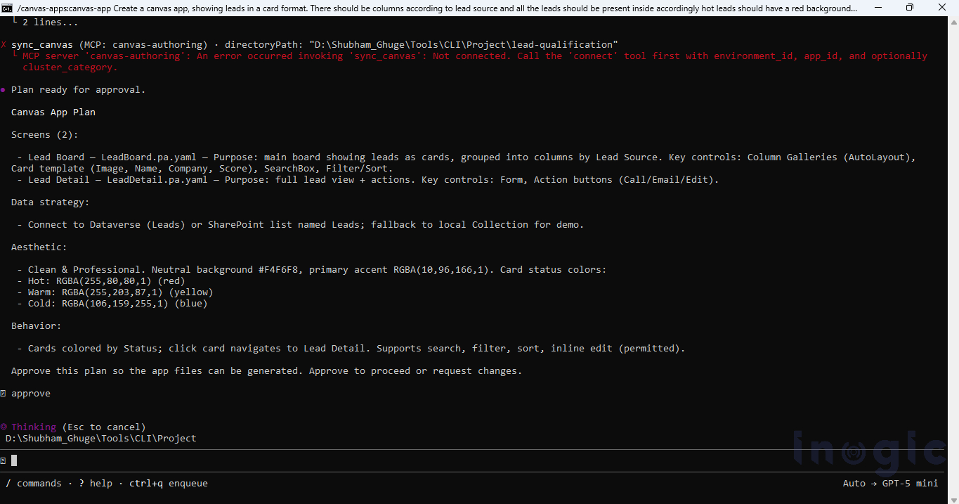
After you submit the prompt, the AI agent gets to work. It reads your requirement, checks the necessary connections, and starts building the app for you. One thing I really liked about this experience is that you can actually watch it work in real time, you are not just staring at a loading screen waiting for something to appear.

Canvas App

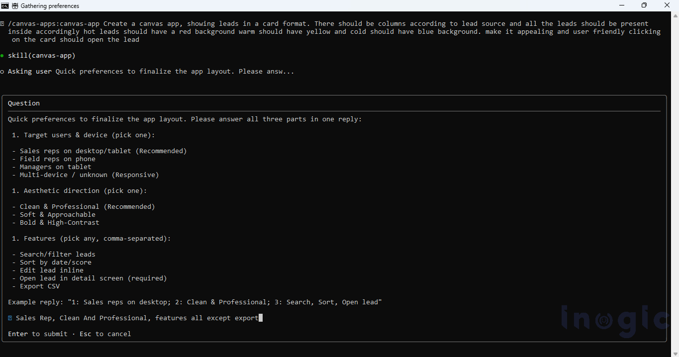
What surprised me is that the agent does not just guess and generate. If your prompt is missing something, it asks. It might check whether you have a preferred layout in mind, whether the data is already set up, or how many screens you need.

Canvas App

This means even a rough prompt gets you a decent result. The agent fills in the blanks by asking the right questions, so you are not stuck fixing a broken app just because you forgot to mention something upfront. The experience feels less like using a conventional tool and more like interacting with a partner that understands your objectives and provides meaningful assistance beyond basic commands.

Once everything is confirmed, it generates the screens, sets up the navigation, connects the data source, and puts together the basic app logic. Within a few minutes you have something you can actually open and use, not just a wireframe or a demo.

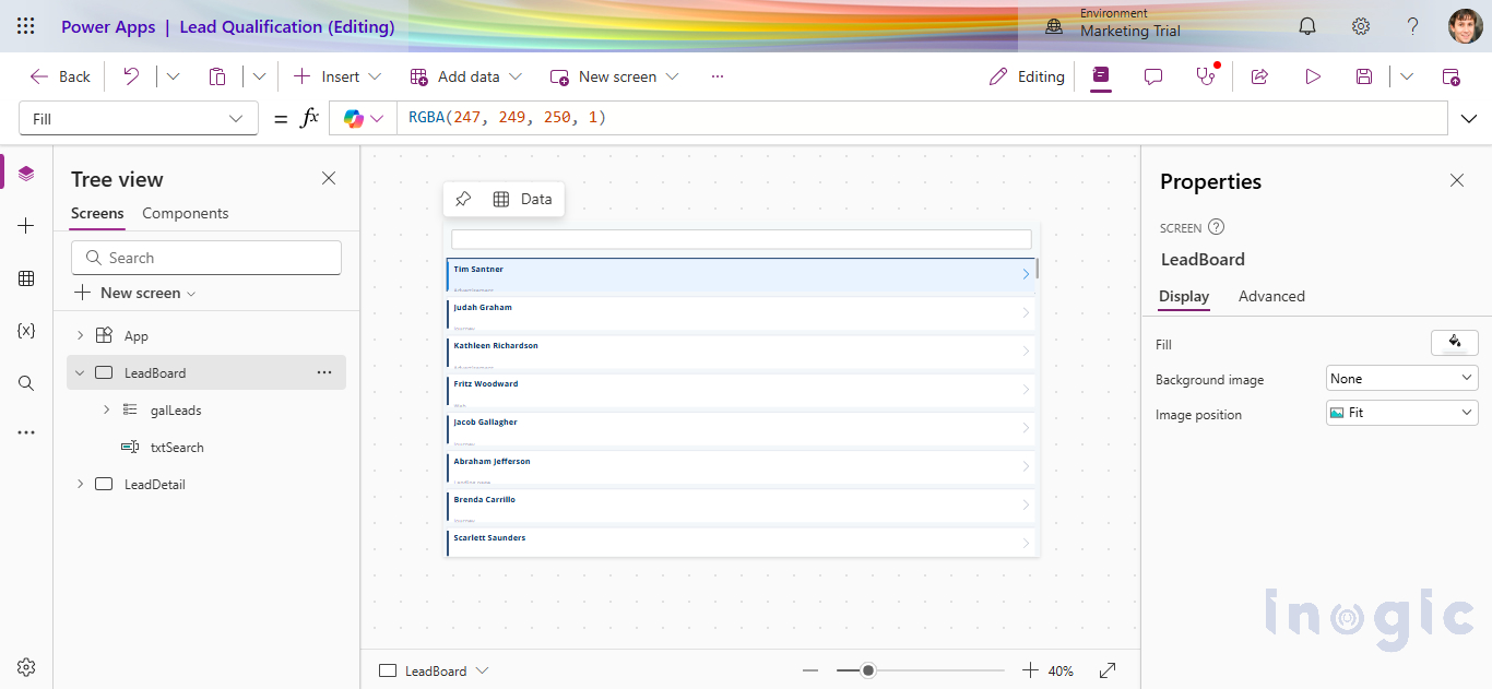
The results were better than I expected. Once the files were ready, the CLI compiled them and pushed the changes directly into the live app through coauthoring – the LeadBoard appeared in Power Apps Studio in real time without any manual copying or pasting. The card layout came through cleanly, showing each lead’s name, company, and source.

Canvas App

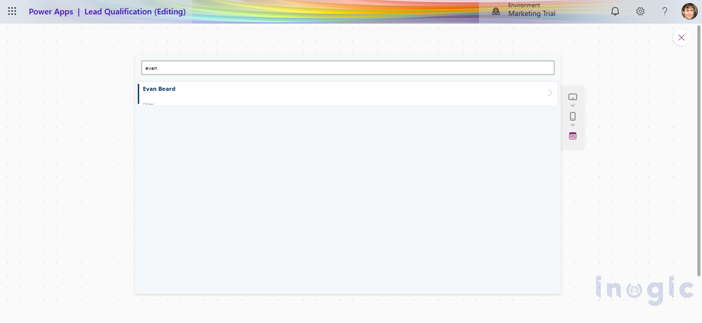
During the generation process, the AI asked whether a search bar should be included. We confirmed yes, and it handled the rest. It is a small thing but it reflects how the agent approaches requirements, it does not assume, it asks, and then it delivers exactly what was agreed.

Canvas App

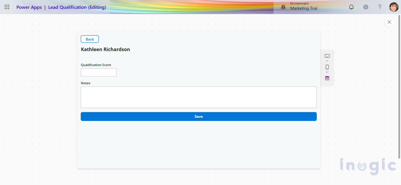
The qualification screen came through the same way, compiled and synced live. A form with a score input, a notes field, and a Save button that writes back to the Lead record in Dataverse.

Canvas App

This is where AI-assisted Canvas App development really shows its value. Business users can take an idea and turn it into a working app quickly, without needing a developer involved from day one.

That said, there is a limit to what the AI handles well. If your app needs complex business logic, external integrations, security controls, or needs to scale across an enterprise, you will still need a developer in the loop. But the AI gives you a solid starting point. The boring setup work, scaffolding screens, wiring up navigation, connecting data, is done for you. Developers can jump straight into the parts that actually need their expertise.

Wrapping Up

The biggest takeaway from this experience is not that AI can generate a Canvas App for you. It is that it gives you a real starting point you can actually work from.

When I started this, I expected the AI to handle most of the heavy lifting. What I got instead was a collaboration, I described what I wanted, the agent generated a foundation, and then the real work began. Fixing YAML schema errors, figuring out the right control types, getting the Gallery variant string correct, iterating on the card design, none of that was automatic. But I was doing it on top of something that already existed, which is fundamentally different from staring at a blank canvas.

For business users, this matter because they can now describe an idea in plain English and get something tangible back within minutes. They do not need a developer just to see what an app might look like.

For developers, the value is different. The scaffolding, screens, navigation, basic data connections, is handled. You come in for the parts that actually need your skills: the business logic, the integrations, the performance tuning, the governance. The repetitive setup work that used to eat the first day of any project is largely gone.

That said, AI tooling for Canvas Apps is still maturing. The YAML schema is strict, control type strings are version-specific, and the gap between what the agent generates and what Studio actually accepts requires hands-on debugging. Knowing the platform well is still a prerequisite for getting the most out of these tools, not a nice to have.

Canvas App development is moving toward an AI-assisted engineering workflow. We are not there yet, but projects like this make it clear the direction is set.

The post AI-Assisted Canvas App Development Using External Tools in Power Apps first appeared on Microsoft Dynamics 365 CRM Tips and Tricks.

  •  

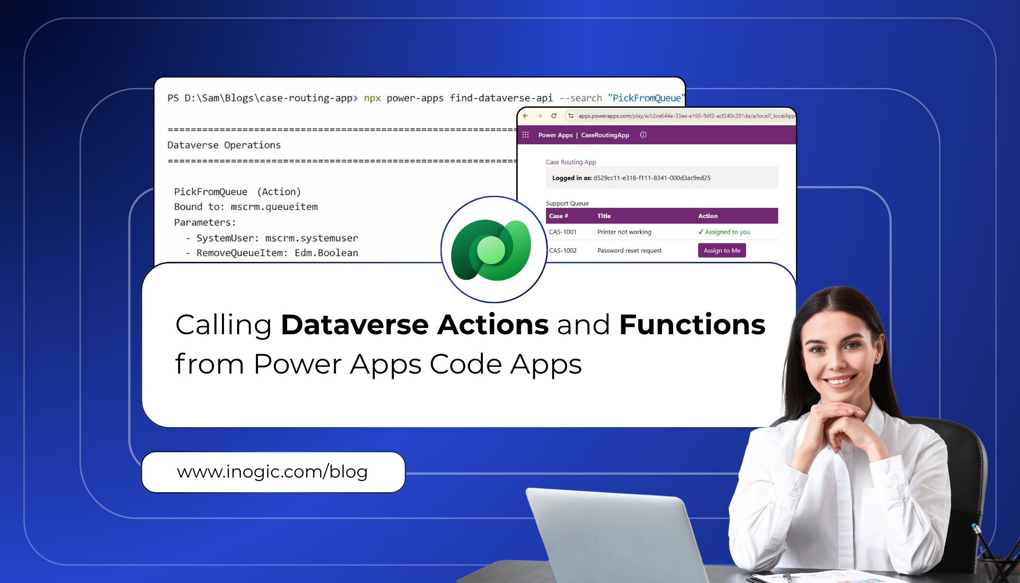
Calling Dataverse Actions and Functions from Power Apps Code Apps

DataverseWhen building Power Apps code apps, one of the most powerful things you can do is reach directly into Dataverse to trigger business logic. Whether it is routing a support ticket to the right queue, checking who the current user is, or running a custom API operation, Dataverse actions and functions are the engine behind most enterprise workflows.
In the past, calling these operations required manually writing Web API fetch calls, constructing the right URLs, and handling typed responses by hand. It worked, but it was slow, error-prone, and hard to maintain as schemas evolved.

Microsoft has now introduced a much cleaner developer experience through the Power Apps npm CLI. With just two commands — find-dataverse-api and add-dataverse-api — you can discover operations in your Dataverse environment, generate fully typed TypeScript service classes, and call them directly from your code app with confidence.

This blog walks through exactly how to do that, using a real-world scenario: a support team that needs to automatically route incoming cases to the correct queue based on priority.

Client Scenario: Automated Case Routing

A client running a customer support operation on Dynamics 365 came to us with a specific pain point. Their agents were starting every shift by manually scanning a shared queue, finding cases relevant to them, and self-assigning each one individually through the Dynamics 365 UI. With dozens of queued cases at any given time, agents were spending the first 15–20 minutes of every shift just on assignment, before they had even looked at a single customer issue.

They needed a code app that displayed all cases currently sitting in the queue and allowed an agent to pick and assign any case to themselves with a single click. The assignment logic already existed as a Dataverse bound action called PickFromQueue. The challenge was invoking it cleanly from a modern Power Apps code app.

The requirements the client laid out were straightforward:

  • View all active cases in a clean, filterable list
  • Select a case from the queue and assign it to yourself with one click
  • Show who is currently logged in so agents can confirm their session
  • Ensure all operations are type-safe and maintainable

This is exactly the kind of scenario the add-dataverse-api command was built for.

Prerequisites

Before following this guide, make sure the following are in place:

  • A Power Apps code app initialised using npx power-apps init
  • The @microsoft/power-apps package at version 1.1.1 or later in your package.json
  • An active CLI session (the CLI will prompt you to authenticate if not already logged in)
  • Access to the Dataverse environment that contains the operations you want to call
  • js installed on your machine (version 18 or later recommended)

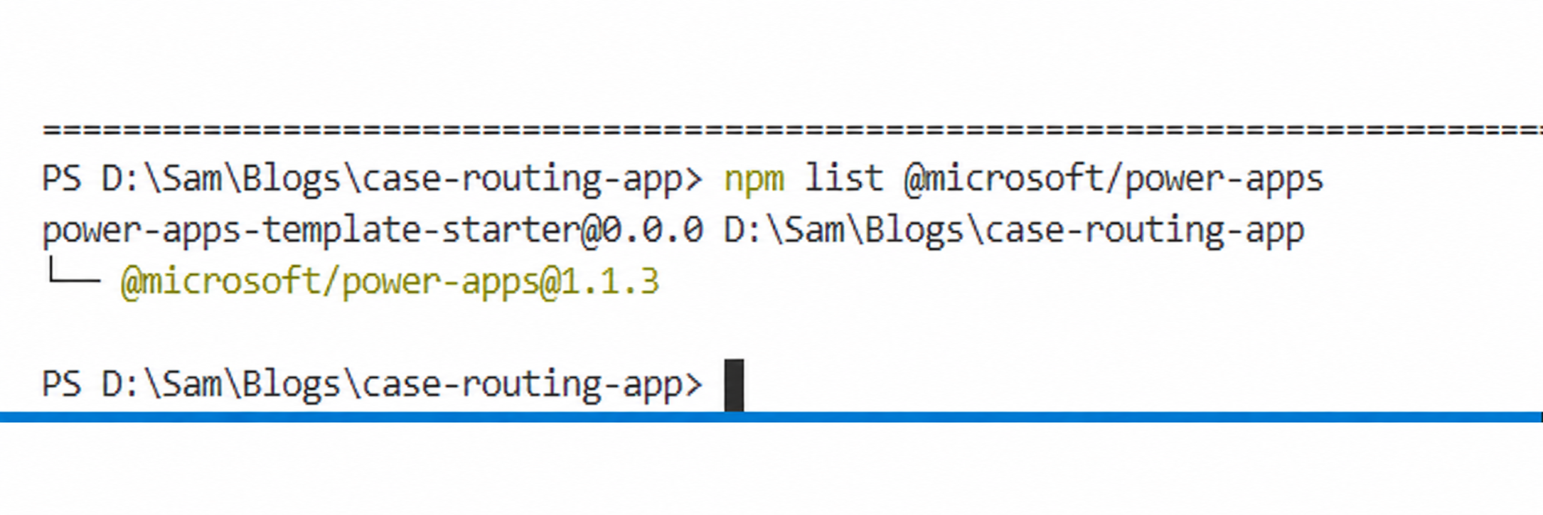
Note: Run npm list @microsoft/power-apps to confirm the package version (1.1.1 or later). The CLI version (shown by npx power-apps –version) may differ from the package version..

Dataverse 1

Step 1: Discover Available Dataverse Operations

The first step is to find out which Dataverse operations are available in your environment. The find-dataverse-api command performs a case-insensitive substring search against the operation names in your connected environment.

For this scenario, we need two operations. The first is WhoAmI, which identifies the current logged-in user. The second is PickFromQueue, which picks a case from a queue and assigns it to a specified user.

Finding WhoAmI

Run the following command in your terminal from inside the code app project folder:

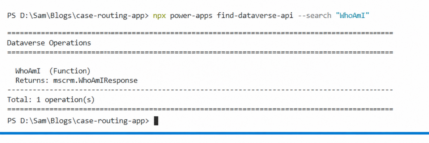
npx power-apps find-dataverse-api --search "WhoAmI"

The output will show the operation name, its kind (Function or Action), and its return type:

Dataverse

Finding PickFromQueue

Next, search for the PickFromQueue action:

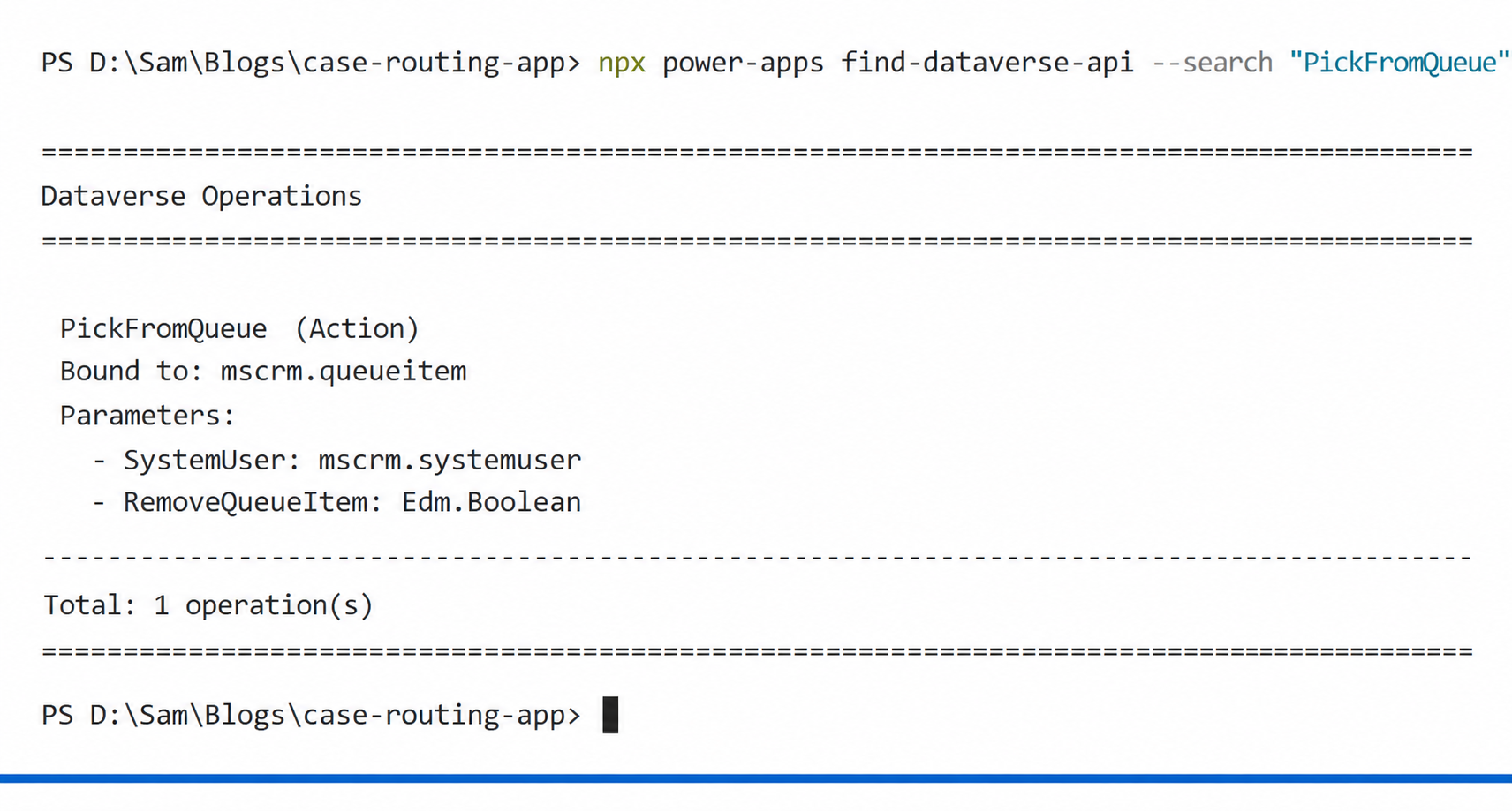
npx power-apps find-dataverse-api --search "PickFromQueue"

You will see something like this:

Dataverse

Notice that PickFromQueue is a bound action — it is bound to mscrm.queueitem, meaning it must be called with the GUID of the queue item record as its first argument. This is an important distinction that affects how the generated service method works, which we will cover shortly.

If you want to inspect the raw JSON output for scripting purposes, add the –json flag:

npx power-apps find-dataverse-api --search "PickFromQueue" --json

Step 2: Add the Operations to Your Code App

Once you have confirmed the operation names, use the add-dataverse-api command to wire them into your project. This command does several things automatically:

  • Fetches the full operation definition from your environment’s Dataverse metadata endpoint
  • Creates a schema file at the configured schema path
  • Generates TypeScript model files for any entities referenced in the operation
  • Generates a typed service class for the operation
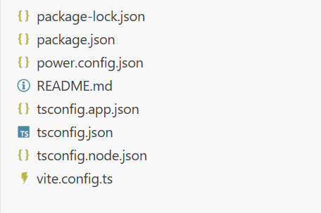
  • Updates power.config.json with the necessary database reference
  • Regenerates dataSourcesInfo.ts to include the new operation

Adding WhoAmI

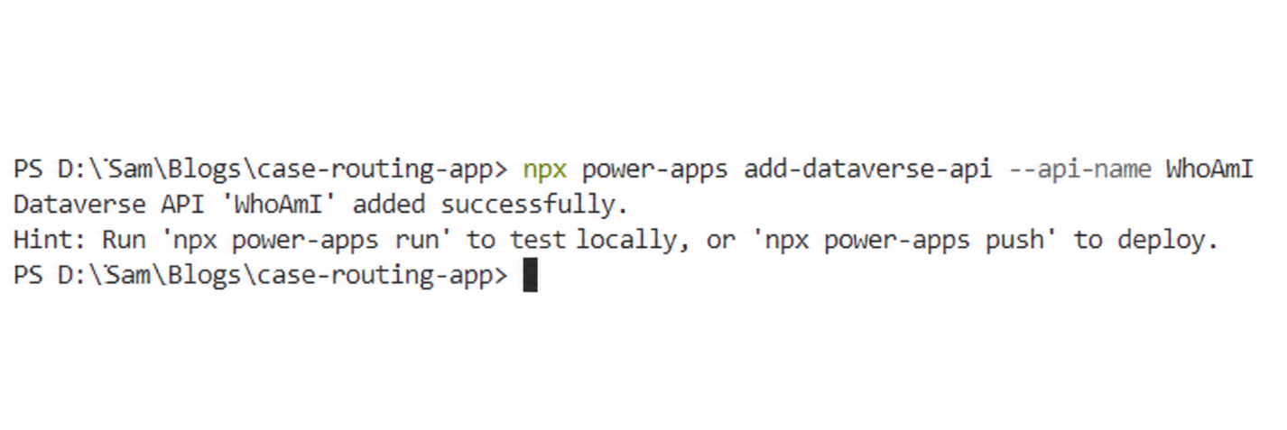
npx power-apps add-dataverse-api --api-name WhoAmI

On success, you will see:

Dataverse 1

Adding PickFromQueue

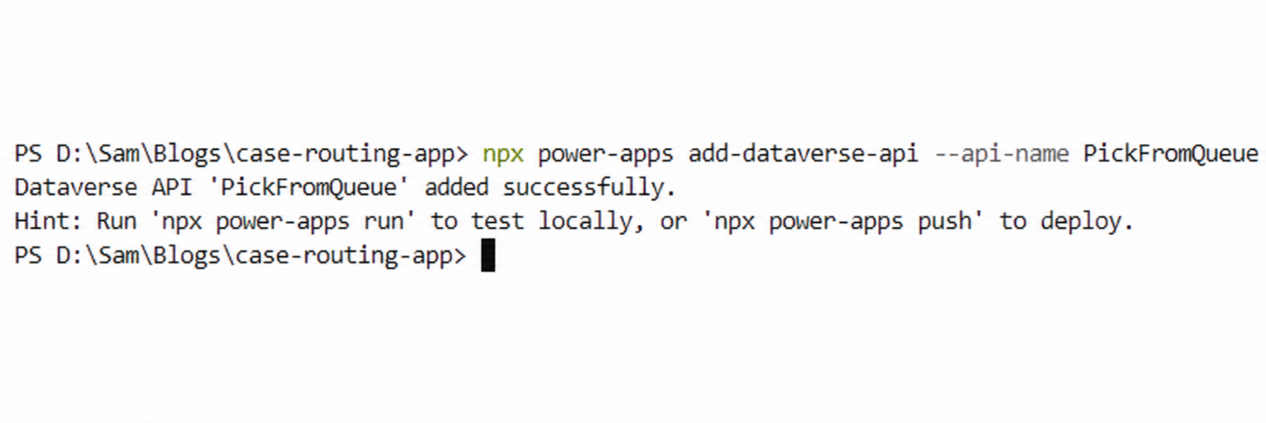
npx power-apps add-dataverse-api --api-name PickFromQueue

Or using the short alias:

Dataverse

npx power-apps add-dataverse-api -n PickFromQueue

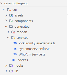
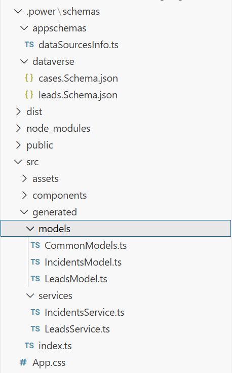
Once both commands complete, your project structure will include new generated files. Here is a summary of what was created or updated:

File What Changed
schemas/dataverse/WhoAmI.Schema.json Created — operation schema
schemas/dataverse/PickFromQueue.Schema.json Created — operation schema
schemas/appschemas/dataSourcesInfo.ts Regenerated to include both operations
power.config.json Updated with default.cds database reference
generated/services/WhoAmIService.ts Generated typed service class
generated/services/PickFromQueueService.ts Generated typed service class

Dataverse

Step 3: Use the Generated Services in Your App

With the service classes generated, you can now import and call them directly in your application code. The CLI handles all the Web API URL construction, authentication headers, and response parsing behind the scenes.

Calling WhoAmI

Import the WhoAmIService from the generated services directory and call it to retrieve the current user’s identity:

import { WhoAmIService } from './generated/services/WhoAmIService';

const userInfo = await WhoAmIService.WhoAmI() as any;

const currentUserId = userInfo.UserId;

const businessUnitId = userInfo.BusinessUnitId;

const orgId = userInfo.OrganizationId;

The result object contains three GUIDs — UserId, BusinessUnitId, and OrganizationId — all fully typed. In the case routing app, we use the UserId to display which agent is currently logged in, giving the team lead confidence before performing any routing action.

Calling PickFromQueue

The PickFromQueue action is a bound operation, which means the generated service method takes the queue item GUID as its first argument, followed by the operation parameters:

import { PickFromQueueService } from './generated/services/PickFromQueueService';
const handlePickCase = async (queueItemId: string, currentUserId: string) => {

const systemUser = {

'@odata.type': 'Microsoft.Dynamics.CRM.systemuser',

systemuserid: currentUserId

};

await PickFromQueueService.PickFromQueue(

queueItemId,    // GUID of the queue item (first arg for bound actions)

systemUser,     // The system user to assign the case to

true            // RemoveQueueItem — remove from queue after picking

);

console.log('Case picked from queue successfully');

};

The function picks the case from the queue and assigns it to the specified user. When RemoveQueueItem is true, the item is automatically removed from the queue to prevent duplicate assignments.

Note: For bound operations, the first argument is always the GUID of the record the action is bound to. In this case, PickFromQueue is bound to mscrm.queueitem, so the first argument is the queue item ID.

Step 4: Build the Case Routing UI

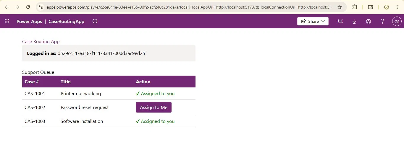
With both services wired up, the final step is to build the actual interface the team leads will use. The component needs to show a list of open cases, allow selection, and trigger the routing action.

Below is a simplified version of how the component comes together:

import { useEffect, useState } from 'react';

import { WhoAmIService } from './generated/services/WhoAmIService';

import { PickFromQueueService } from './generated/services/PickFromQueueService';

// Sample cases in queue (in production, fetch from Dataverse)

const queuedCases = [

{ id: 'CAS-1001', title: 'Printer not working',    queueItemId: '< queue-item-guid-1 >' },

{ id: 'CAS-1002', title: 'Password reset request', queueItemId: '< queue-item-guid-2 >' },

{ id: 'CAS-1003', title: 'Software installation',  queueItemId: '< queue-item-guid-3 >' },

];

export const CaseRoutingApp = () => {

const [currentUserId, setCurrentUserId] = useState('');

const [routedCases, setRoutedCases] = useState<Record<string, boolean>>({});

useEffect(() => {

WhoAmIService.WhoAmI().then((r: any) => setCurrentUserId(r.UserId));

}, []);

const handlePickCase = async (queueItemId: string, caseId: string) => {

const systemUser = {

'@odata.type': 'Microsoft.Dynamics.CRM.systemuser',

systemuserid: currentUserId

};

await PickFromQueueService.PickFromQueue(queueItemId, systemUser, true);

setRoutedCases(prev => ({ ...prev, [caseId]: true }));

};

return ( /* your JSX here */ );

};

Dataverse 

Once you are happy with the result in local preview, run:

npx power-apps push

This deploys the app to your Dataverse environment and makes it available inside the model-driven app.

Important Notes and Common Pitfalls

A few things to keep in mind as you work with this feature:

Bound vs. Unbound Operations

The distinction between bound and unbound operations matters for how you call the generated service method. Bound operations always take an id: string as the first argument (the GUID of the record the operation is bound to). Unbound operations, like WhoAmI, take only the declared parameters.

The CLI detects the operation type automatically and generates the method signature accordingly. You do not need to configure anything manually.

Re-running add-dataverse-api is Safe

If the operation’s signature changes in your environment — for example, a developer added a new optional parameter — simply re-run the same command:

npx power-apps add-dataverse-api --api-name PickFromQueue

The command is idempotent. It overwrites the schema and regenerates the service class with the latest definition. It will not create duplicate entries in power.config.json, and it will not overwrite entity schema files that already exist.

Conclusion

The add-dataverse-api command is a significant quality-of-life improvement for developers building Power Apps code apps. Instead of handwriting Web API calls, managing URL patterns for bound vs. unbound operations, and manually typing response objects, you get fully generated, type-safe service classes in seconds.

For the support team in our scenario, the result was exactly what the client needed. Cases are now routed with a single click, the correct agent identity is confirmed before any action is taken, and the development time was a fraction of what it would have taken with raw Web API calls.

Whether you are calling WhoAmI to verify the current session, triggering a bound action like PickFromQueue to execute business logic, or invoking a custom operation your team has built, the CLI handles the scaffolding so you can focus on building the experience.

FAQs

What is add-dataverse-api in Power Apps code apps?

The add-dataverse-api command is a Power Apps CLI feature that generates fully typed TypeScript service classes for Dataverse actions and functions. It eliminates the need to manually write Web API fetch calls when building Power Apps code apps.

How do you call Dataverse actions from a Power Apps code app?

You can call Dataverse actions in a Power Apps code app by using the Power Apps npm CLI commands find-dataverse-api and add-dataverse-api. These commands generate typed service classes that let developers invoke Dataverse actions directly in TypeScript.

What is the difference between bound and unbound Dataverse actions?

Bound Dataverse actions are linked to a specific Dataverse table or record and require a record GUID as the first parameter. Unbound actions are standalone operations that do not require a record reference. For example, PickFromQueue is bound, while WhoAmI is unbound.

The post Calling Dataverse Actions and Functions from Power Apps Code Apps first appeared on Microsoft Dynamics 365 CRM Tips and Tricks.

  •  

What Is Relationship Mapping in Dynamics 365 CRM? 10 FAQs on CRM Data Visualization

Sales teams working in Dynamics 365 CRM often struggle to understand complex stakeholder relationships inside large accounts. Relationship mapping in Dynamics 365 CRM is a visual way to understand how accounts, contacts, stakeholders, and opportunities are connected. By transforming CRM records into visual diagrams, teams can identify decision makers, influence paths, and organizational structures more easily.
In this guide, we answer 10 common questions about relationship mapping and CRM data visualization in Dynamics 365 CRM.

What is relationship mapping in Dynamics 365 CRM, and how to implement it?

Relationship mapping in Dynamics 365 CRM is a visual way to understand how accounts, contacts, stakeholders, and opportunities are connected. Instead of analyzing raw records or lists, CRM users can see relationships through visual diagrams, helping them identify key decision makers, influence paths, and hidden connections that affect sales outcomes.

Relationship mapping helps CRM teams:

  • Visualize connections between accounts, contacts, and opportunities
  • Identify decision makers and influencers
  • Understand organizational hierarchies
  • Discover hidden relationships that affect deals

Modern relationship mapping tools like mind maps using Map My Relationship, hierarchy views, and influence maps make relationship mapping easier by transforming complex CRM data into clear visual networks.

How does relationship mapping help close deals in Dynamics 365 CRM?

Relationship mapping helps close deals faster by identifying the right people to engage within a customer organization. By visualizing decision makers, influencers, and reporting structures, sales teams can prioritize key contacts and build stronger engagement strategies that accelerate deal progression.

Relationship mapping enables sales teams to:

  • Identify decision makers vs influencers
  • Understand reporting structures
  • Track existing relationships across accounts
  • Plan multi-threaded sales strategies

Visual CRM tools like Map My Relationship allow teams to see who knows whom, which improves outreach and stakeholder engagement.

How can you visualize relationships between accounts and contacts in Dynamics 365?

You can visualize relationships between accounts and contacts in Dynamics 365 by using CRM visualization tools that convert relational data into visual diagrams such as mind maps, hierarchy trees, or organizational charts. These views make it easier to understand how stakeholders are connected across accounts and opportunities.

Typical CRM visualization methods include:

  • Mind Map View – displays connections between contacts and stakeholders
  • Hierarchy View – shows account structures
  • Tree View – visualizes parent-child relationships
  • Influence Mapping – identifies key decision makers

Solutions like relationship mapping apps for Dynamics 365 enable these visualizations directly inside the CRM interface.

 What is influence mapping in CRM relationship management?

Influence mapping is a CRM technique used to identify the people who influence purchasing decisions within an organization. Instead of focusing only on primary contacts, influence maps visualize connections between stakeholders, helping sales teams understand internal dynamics and build stronger relationship strategies.

Influence mapping helps teams:

  • Identify champions and blockers
  • Understand internal stakeholder influence
  • Plan targeted engagement strategies
  • Navigate complex enterprise accounts

Advanced CRM visualization tools like Map My Relationship represent influence relationships using interactive relationship maps

What are the best ways to visualize complex CRM relationships?

The best ways to visualize complex CRM relationships include using mind maps, hierarchy charts, tree views, and network diagrams. These visualization methods transform CRM records into structured visual models that help users understand connections, organizational structures, and influence paths quickly.

Popular CRM visualization approaches include:

Visualization Type  Purpose
Mind Map Shows relationship networks
Hierarchy Chart Displays organizational structure
Tree View Maps parent-child relationships
Influence Map Shows decision-making power

Modern Dynamics 365 tools like Map My Relationship integrate these views directly within CRM dashboards.

What Is Relationship Mapping in Dynamics 365 CRM? 10 FAQs on CRM Data VisualizationCan Dynamics 365 CRM show account hierarchies visually?
Yes, Dynamics 365 CRM can display account hierarchies visually using hierarchy charts and relationship visualization tools. These visual structures help CRM users understand parent companies, subsidiaries, and business unit relationships within large organizations.

Account hierarchy visualization helps with:

  • Enterprise account management
  • Understanding corporate structures
  • Planning account-based sales strategies
  • Managing multi-location customers

Advanced CRM apps like Map My Relationship enhance these capabilities by providing interactive hierarchy views and relationship diagrams.

What is the best tool for relationship mapping in Dynamics 365 CRM?

The best relationship mapping tools for Dynamics 365 CRM allow users to visualize complex relationships through multiple interactive views such as mind maps, tree diagrams, and influence maps. These tools help sales and relationship managers understand stakeholder networks and account structures without leaving the CRM environment.

An effective relationship mapping solution should provide:

  • Mind Map relationship visualization
  • Account hierarchy charts
  • Influence mapping
  • Tree and network views
  • Interactive CRM relationship diagrams

Solutions like Map My Relationships transform Dynamics 365 data into visual relationship intelligence, making it easier for teams to analyze connections and manage complex accounts.

What is stakeholder mapping in CRM?

Stakeholder mapping in CRM is the process of identifying and visualizing individuals who influence purchasing decisions within an organization. By mapping stakeholders, sales teams can understand relationships between decision makers, influencers, and internal champions.

Stakeholder mapping helps with:

  • Enterprise deal management
  • Account-based selling strategies
  • Influence identification
  • Strategic relationship planning

Visualization tools often represent stakeholders through interactive relationship diagrams.

What is influence mapping in Dynamics 365 Sales?

Influence mapping is a technique used to identify how different stakeholders affect purchasing decisions within an organization. Instead of focusing only on primary contacts, influence maps show how decision makers, influencers, and internal champions are connected.

Influence mapping helps sales teams:

  • Understand internal power dynamics
  • Identify champions and blockers
  • Plan targeted engagement strategies
  • Navigate complex enterprise sales cycles

CRM visualization tools often represent influence relationships using interactive maps.

What Is Account Relationship Mapping in CRM?

Account relationship mapping in CRM is the process of visually representing how contacts, departments, subsidiaries, and partner organizations are connected to a customer account. Instead of viewing isolated records, relationship maps display these connections in a structured visual format, helping sales teams understand influence networks, organizational structures, and key stakeholders.

Account relationship mapping typically includes:

  • Mapping internal contacts: Identifying how decision makers, influencers, and end users are connected within an organization.
  • Mapping partner relationships: Understanding connections between customers, vendors, resellers, or strategic partners involved in the business ecosystem.
  • Mapping subsidiaries and parent companies: Visualizing corporate structures such as holding companies, regional branches, and business units.
  • Tracking cross-account connections: Discovering relationships between contacts who interact with multiple accounts, departments, or opportunities.

These relationships are often visualized using relationship network diagrams, org charts, hierarchy charts, or stakeholder maps, allowing CRM users to quickly interpret complex account structures and engagement pathways. Tools designed for CRM relationship visualization can transform standard CRM records into interactive relationship maps, making it easier to analyze stakeholder influence and manage complex enterprise accounts.

Relationship mapping transforms traditional CRM records into visual relationship intelligence. By combining stakeholder mapping, influence visualization, and account hierarchy views, sales teams gain a clearer understanding of complex customer ecosystems inside Dynamics 365.

Get a 15-day free trial from Inogic Website or Microsoft Marketplace. If you want an end to end implementation demo, reach out to us at crm@inogic.com.

The post What Is Relationship Mapping in Dynamics 365 CRM? 10 FAQs on CRM Data Visualization first appeared on Microsoft Dynamics 365 CRM Tips and Tricks.

  •  

How to Use JSON Output in AI Builder Prompts for Structured Automation

JSON Output If you’ve been working with AI in your business processes lately, you’ve probably run into a really frustrating roadblock: the gap between the chatty text an AI wants to give you and the structured data your automation actually needs.
Let’s say you’re building a Power Automate flow to pull details out of customer emails. You want the person’s name, the priority, and the category. Ideally, you want to get back something clean like this:

JSON:

{

"customer_name": "Sarah Johnson",

"priority": "High",

"issue_category": "Billing"

}

Instead, the AI usually gives out a whole paragraph:

“The customer, Sarah Johnson, appears to have a high-priority concern related to billing. It would be advisable to route this to the finance team for further assistance.”

That’s great if a human is reading it. But for an automated flow? It’s a nightmare. You end up trying to write expressions using ‘split()’ or regular expressions just to grab the values you want, and if the AI rephrases even slightly on the next run, those expressions break. The core issue is straightforward: AI produces conversational text, but automated systems require structured, predictable data.

Microsoft’s Power Platform has a fix for this inside the AI Builder Prompt action. Whether you are using Power Automate or Copilot Studio, you can just tell the AI to hand you back perfectly formatted JSON instead of a paragraph. And the best part? That JSON maps straight into your Dynamics 365 fields, your flow conditions, or your Copilot variables. No messy parsing needed.

Understanding AI Builder Prompts

The Prompt tool can be accessed via the Power Apps maker portal, under AI Builder in Prompts. It allows users to define a custom AI instruction with optional dynamic input variables, and the generated response can be consumed in Power Automate or in Copilot Studio. By default, the output is plain text, but switching the output format to JSON enables the AI to return a structured object that downstream actions consume directly.

As a general guideline: use text output when communicating with a user, and JSON output when communicating with a system.

Setting Up a Prompt with JSON Output:

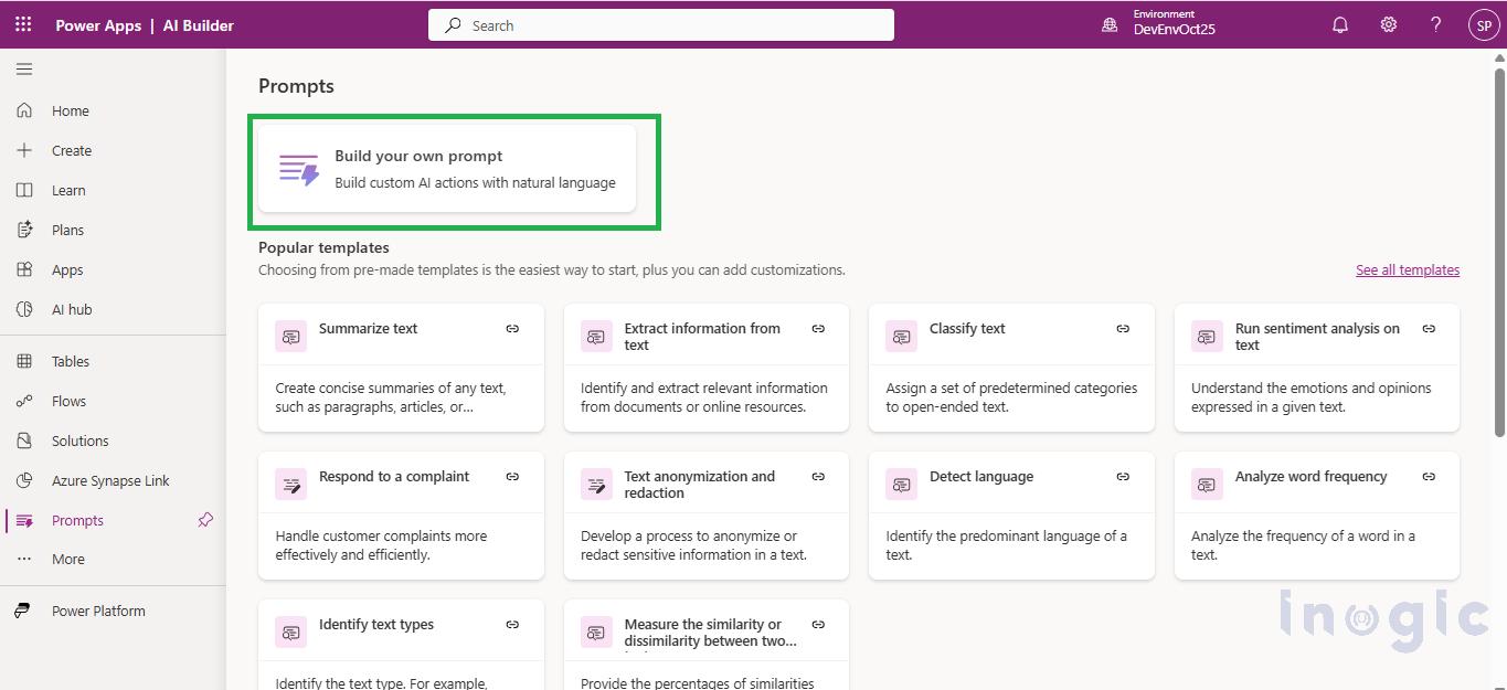
Navigate to Power Apps maker portal, under AI Builder in Prompts select the Build your own Prompt.

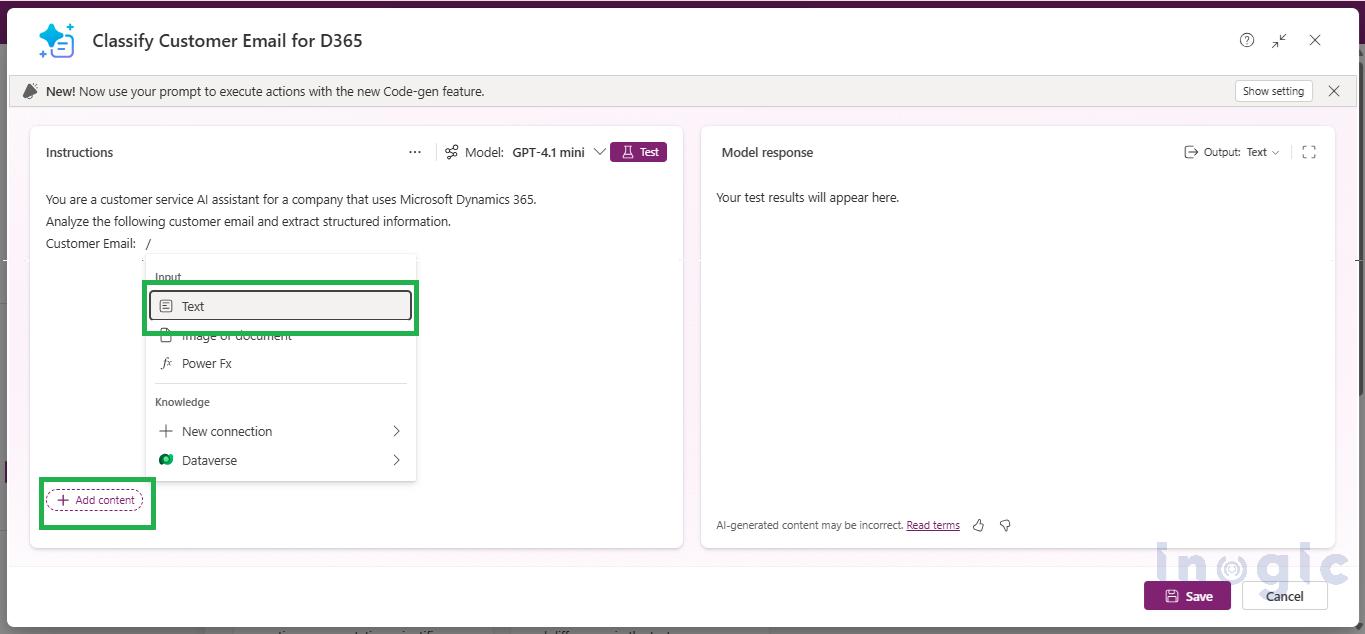
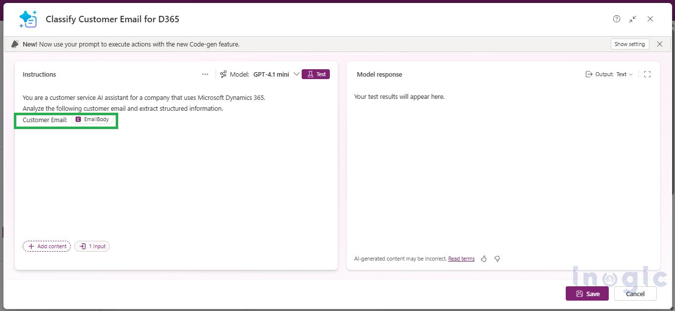
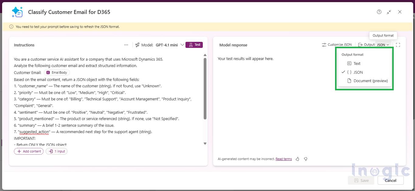
Configuring JSON Output with AI Builder Prompts in Power AppsWhen writing the prompt, three elements are essential: a clear task definition, the JSON schema (field names, data types, allowed values), and explicit output constraints (return only the JSON, no extra text or formatting). Define dynamic inputs by clicking on Input, for example, an ‘EmailBody’ variable to hold customer email text passed from a flow.
Configuring JSON Output with AI Builder Prompts in Power Apps

Configuring JSON Output with AI Builder Prompts in Power AppsIn the configuration panel, change the Output format from Text to JSON. Use the built-in Test feature to validate the response structure.
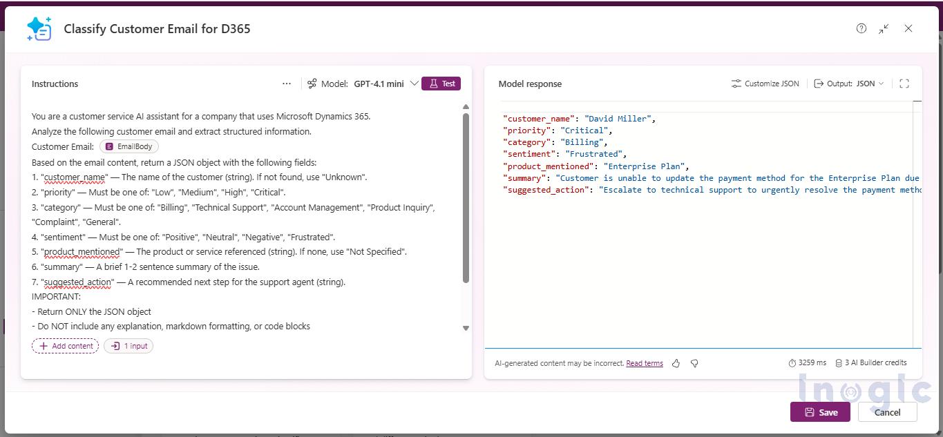
Configuring JSON Output with AI Builder Prompts in Power Apps

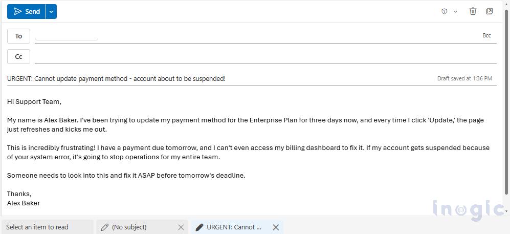
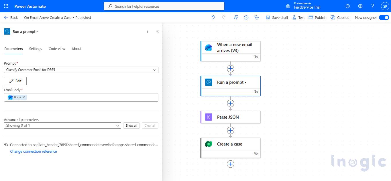
Configuring JSON Output with AI Builder Prompts in Power AppsOnce tested, integrate it into Power Automate via the “Run a prompt” action, or into Copilot Studio as a Prompt Tool directly or use it within a topic.
Automated Email Categorization with Power Automate

Support teams get flooded with emails every single day. Usually, a human has to sit there, read each one, figure out the priority, guess the customer’s mood, and write a summary.

By combining the Prompt tool with JSON output, you can put this whole categorization process on autopilot. Here is roughly how it flows:

– An Email Arrives: A distressed customer sends an email regarding a critical payment failure on their account.

Configuring JSON Output with AI Builder Prompts in Power Apps– The Prompt Analyzes: Your flow triggers immediately, grabs that email text, and ships it over to the AI Builder Prompt you built.
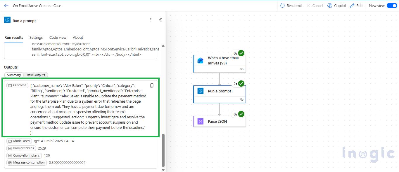
Configuring JSON Output with AI Builder Prompts in Power Apps– Clean Data is Structured: The AI reads it, understands the context, and hands you back a neat JSON block.
Configuring JSON Output with AI Builder Prompts in Power Apps– Parsed for Automation: Using the “Parse JSON” action in Power Automate, the structured data is instantly converted into dynamic content. You can now use these variables anywhere in your flow to route the email to the right team, trigger an urgent alert, or seamlessly create a record in Dataverse.
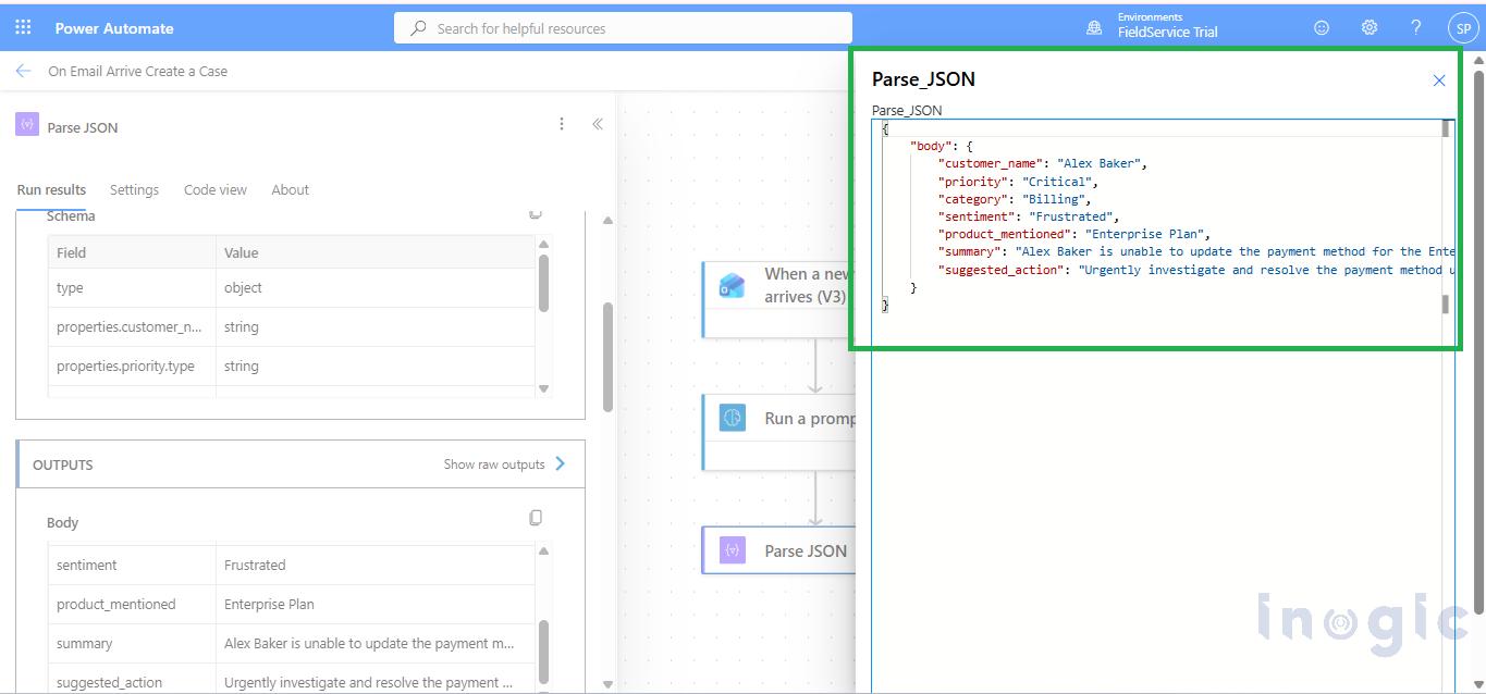
Configuring JSON Output with AI Builder Prompts in Power AppsConclusion

Switching AI Builder Prompts to JSON output is a simple but powerful enhancement for building production-ready automation.

While text responses are useful for human interaction, JSON output provides the structure required for reliable system integration.

This approach:

  • Eliminates fragile parsing logic
  • Ensures consistent AI responses
  • Enables direct mapping to business systems

For any solution involving Power Automate, Copilot Studio, or Dynamics 365, using JSON output is one of the most impactful improvements you can make with minimal effort.

FAQs

What is JSON output in AI Builder Prompts?

JSON output is a structured response format in AI Builder Prompts that returns data as key-value pairs instead of conversational text, making it easier for automation systems to process.

 Can JSON output integrate with Dynamics 365?

Yes, structured JSON fields can map directly into Dynamics 365 entities and records without additional transformation.

 Can JSON output integrate with Dynamics 365?

Yes, structured JSON fields can map directly into Dynamics 365 entities and records without additional transformation.

What problems does JSON output solve in AI automation?

It eliminates inconsistent AI responses, removes the need for regex or string parsing, and ensures stable automation workflows.

How do I enable JSON output in Power Apps AI Builder Prompts?

In the Power Apps maker portal, go to AI Builder → Prompts, create or edit a prompt, and change the output format from Text to JSON in the configuration panel.

The post How to Use JSON Output in AI Builder Prompts for Structured Automation first appeared on Microsoft Dynamics 365 CRM Tips and Tricks.

  •  

Generating and Sharing Screen in PDFs from D365 Sales Using Canvas Apps

Canvas Apps

In many Dynamics 365 Sales implementations, sales users need a simple and intuitive way to preview a quote, generate a PDF, and share it with customers. Traditionally, this requirement is handled using Word templates, which often feel rigid, require backend configuration, and do not provide a smooth preview experience for users.

Microsoft has introduced PDF generation and PDF preview capabilities in Canvas apps, making it possible to convert Canvas app screens or containers into PDF files and preview them directly within the app. These capabilities open new possibilities for creating user-friendly, preview-first document generation experiences in D365 Sales.

In this blog, we demonstrate how to build a Canvas app that allows users to view quotes, preview quote details as a PDF, and prepare the PDF for sharing, all using native Power Apps functionality.

How This Works (High-Level Overview)

This approach uses a Canvas app embedded in D365 Sales to display quote data. A specific container holding the quote layout is converted into a PDF using the PDF() function. The generated PDF is stored in a variable and passed to the PDF Viewer control, allowing users to preview the document before sharing or processing it further.

App Design Overview

To keep the user experience simple and intuitive, the app is designed with two screens.

Screen 1: Active Quotes

The first screen displays active quotes in a gallery, as shown below.

This screen acts as the entry point for the user and allows quick selection of a quote.

When a user selects a quote:

  • The selected quote is stored in a variable
  • The app navigates to the quote preview screen

Generating and Sharing Screen in PDFs

This approach keeps quote selection fast and avoids unnecessary navigation between screens.

Screen 2: Quote Details and Quote Preview

The second screen is designed to display quote details and a PDF preview side by side.

On this screen, I have used two containers:

  • One container to display the quote details
  • Another container to preview how the quote will appear in the PDF Viewer

To display the PDF in the PDF Viewer, the following approach is used:

Generating the PDF

The PDF() function is used to generate a PDF from the quote details container.
The generated PDF is stored in a variable (MyPdf).

Generating and Sharing Screen in PDFs

This ensures that the same layout used to display quote details is reused for PDF generation.

Previewing the PDF

The MyPdf variable is then passed to the PDF Viewer control, allowing users to preview exactly how the PDF will look before it is shared.

Generating and Sharing Screen in PDFs

This provides a true “what you see is what you get” experience for the user.

Below is how the page layout looks with the quote details on one side and the PDF preview on the other.

Generating and Sharing Screen in PDFs


Generating and Sharing Screen in PDFs

Important Note on Experimental Features

At the time of writing, both the PDF () function and the PDF Viewer control are marked as Experimental features in Power Apps.

Benefits of This Approach

  • Preview-first user experience
  • No dependency on Word templates
  • Flexible and easily customizable layouts
  • Consistent PDF output
  • Simple integration with Power Automate for further processing

Real-World Use Cases

This pattern can be applied across multiple D365 Sales and business scenarios, including:

  • Quote generation and sharing
  • Invoice previews
  • Order confirmations
  • Service reports
  • Custom sales documents

The same reusable layout approach ensures consistency across documents while keeping the user experience simple.

FAQs

Can Canvas apps generate PDFs in D365 Sales?
Yes. Canvas apps support the PDF() function, which allows screens or containers to be converted into PDF files that can be previewed or shared.

Do I need Word templates to generate PDFs in D365 Sales?
No. This approach removes the dependency on Word templates by generating PDFs directly from Canvas app layouts.

Can users preview PDFs before sharing them?
Yes. The PDF Viewer control allows users to preview the generated PDF inside the Canvas app before sharing.

Can this be integrated with Power Automate?
Yes. The generated PDF can be easily passed to Power Automate for emailing, storage, or further processing.

Conclusion:

By combining Canvas apps with the PDF() function and PDF Viewer control, it is now possible to create lightweight and flexible document generation experiences directly within D365 Sales.

This approach allows users to preview, generate, and share quote PDFs using a single reusable layout, improving usability and reducing dependency on backend templates.

The same pattern can be extended to other scenarios such as invoices, orders, service reports, or any use case where formatted documents are required.

The post Generating and Sharing Screen in PDFs from D365 Sales Using Canvas Apps first appeared on Microsoft Dynamics 365 CRM Tips and Tricks.

  •  

How to Customize the Task Pane in Project Operations

Earlier, the Task Details pane in Project Operations was standard and not customizable at admin level. When users clicked the info icon present next to a task, a fixed task pane from Project showed only predefined fields. Organizations could not add custom fields or modify the layout, so users often had to navigate away from the task grid to view or update additional task details.

Now, with the latest update, the task pane is customizable. Using this feature, we can customize tasks of a project within the Task Pane itself. This allows users to view and update all relevant task information directly from the task pane, improving efficiency while still keeping the option to access the original standard view if needed.

In this blog, let us explore how to Customize Task Pane in Project Operations.

  • To enable theCustomize Task Pane feature in Project Operations, navigate to the Parameters entity present in the Settings
  • Click on the Feature Control button on the ribbon bar, as shown below.

How to Customize the Task Pane in Project Operations

  • After enabling Customize Task Pane feature, navigate to Projects area under Projects group click on Projects

Note: Choose Existing Project or create a New Project.

How to Customize the Task Pane in Project Operations

  • Let us create a project with all the required details, save it and then navigate to the Tasks tab

How to Customize the Task Pane in Project Operations

How to Customize the Task Pane in Project Operations

  • Add the tasks required to complete your project. Click on any task’s ⓘ icon to view its details in the new Task Side Pane.

How to Customize the Task Pane in Project Operations

How to Customize the Task Pane in Project Operations

  • Now, let us navigate to Power Apps to customize the Task Side Pane. This customization allows users to view and update task details directly from the Task Grid, eliminating the need to open separate pages or navigate away from their current screen.
  • As a result, users can manage tasks more efficiently within a single, streamlined interface.

 Steps to customize the Task Pane:

1. Navigate to Power Apps and click on Tables as below –

How to Customize the Task Pane in Project Operations

2. Search Project Task form and click on it.

How to Customize the Task Pane in Project Operations

3. In Data experiences select Forms & click on Task details

How to Customize the Task Pane in Project Operations

How to Customize the Task Pane in Project Operations

How to Customize the Task Pane in Project Operations

4. Customize the Task details form according to your requirements.

Note: You can customize the task pane whenever you want in Task details and publish it according to your requirements.

How to Customize the Task Pane in Project Operations

Note:  A Resource field is added in Task details form for customization.

5. Click on Save and Publish button to apply the changes.

How to Customize the Task Pane in Project Operations

6. Navigate to Project, Click on Tasks tab and click on any Task’s ⓘ icon to view Task details in new Task Side Pane.

How to Customize the Task Pane in Project OperationsNote: Resource field added in Task details form is visible in Task Pane.
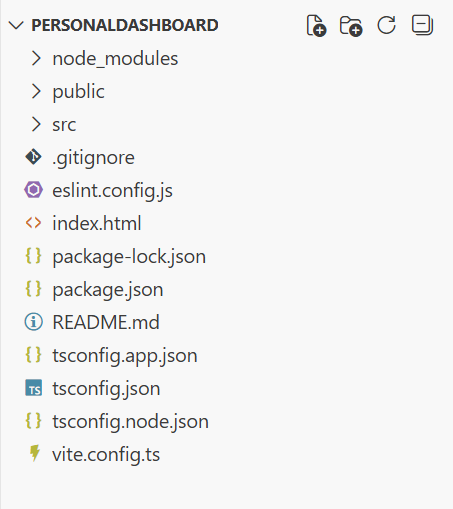
Conclusion:

This approach allows us to customize the Task Details form so users can view and update additional task information directly in the Task Side Pane, without navigating away from the task grid.

The post How to Customize the Task Pane in Project Operations first appeared on Microsoft Dynamics 365 CRM Tips and Tricks.

  •  

Building Standalone Apps with Power Apps Code Apps: Using Dataverse and Office 365 Users Connectors (Part 1)

Power Apps

In the Dynamics 365 and Power Apps ecosystem, we have several options for building applications, each one is for a specific type of requirement. Model-driven Apps works well when we need a structured UI with standard components, while we use Canvas Apps to create custom, mobile-friendly interfaces with a low-code approach. Recently, Microsoft introduced another application type called Code Apps, which offers a completely different way to build applications using pro code approach.

With the introduction of  Power Apps Code Apps, things have changed. Code Apps let us build standalone single page applications using modern web frameworks. These are independent applications that cannot be integrated with Canvas Apps or Model-driven Apps.

The best part is that we get direct access to more than 1,500 standard and premium connectors through the Power Apps SDK. We do not have to write any authentication code, no OAuth flows, no custom APIs, no middleware. We just have to connect and use.

In this article, we’ll walk you through creating a Code App from scratch. We’ll build Personal Dashboard, a simple application that pulls assigned cases and leads from Dataverse and shows current logged in user details using the Office 365 Users and Dataverse connectors.

What Makes Code Apps Different?

We can build a UI of our own choice and connect to a wide range of data sources using more than 1,500 standard and premium connectors provided by the Power Platform. All connections are secure because the Power Apps SDK handles authentication, and each connector enforces user-level permissions. This means the app can only access data that the signed-in user is allowed to see, so there’s no need to write custom authentication code.

Code Apps provide a balanced approach with several key advantages:

  • A standalone application that runs directly within Power Platform
  • Full development with modern web frameworks such as React, Vue, or Angular, with support for  your preferred libraries
  • Direct access to connectors through the Power Apps SDK without custom authentication code
  • Streamlined deployment through a single command to your environment

The connector integration is particularly valuable. Whether the need is to query Dataverse, access current user profile details, or use other services, the connector can be called directly. There’s no need to configure service principals, manage app registrations, or implement token management. The integration works seamlessly within the platform.

Prerequisites

Before getting started, we have to make sure the following prerequisites are in place:

  • Power Apps Premium license with Code Apps enabled environment
  • Visual Studio Code installed
  • Node.js LTS version
  • Power Platform Tools for VS Code extension

Step 1: Setting Up the Code App

Let’s create the app. Open VS Code, launch a PowerShell terminal, and run the following command:

npm create vite@latest PersonalDashboard — –template react-ts

For this application, we are using React as the framework and TypeScript as the variant. After that, navigate to the project folder and install the dependencies:

npm install

Install the node type definitions:

npm i –save-dev @types/node

After executing these commands, the project structure will appear as shown in the image below.

PowerAppsCode

According to the official Microsoft documentation, the Power Apps SDK currently requires the port to be 3000 in the default configuration. To configure this, open vite.config.ts and replace the content with the following code:

import { defineConfig } from 'vite'

import react from '@vitejs/plugin-react'

import * as path from 'path'


// https://vite.dev/config/

export default defineConfig({

base: "./",

server: {

host: "::",

port: 3000,

},

plugins: [react()],

resolve: {

alias: {

"@": path.resolve(__dirname, "./src"),

},

},

});

Note for Mac users: It may be necessary to modify the package.json scripts section.

Change from:

"scripts":  {

"dev": "start vite && start pac code run",

"build": "tsc -b && vite build",

"lint": "eslint .",

"preview": "vite preview"

}

to this

"scripts": {
"dev": "vite && pac code run",
"build": "tsc -b && vite build",
"lint": "eslint .",
"preview": "vite preview"
}

Save the file and run the Code App locally by executing:

npm run dev

Browse to http://localhost:3000. If the application loads successfully, press Ctrl+C to stop the server.

Step 2: Initialize the Code App

First authenticate to Power Platform:

pac auth create

After that, sign in with the credentials and select the environment:

pac env select -env <environment-url>

Initialize the Code App:

pac code init –displayName “Personal Dashboard”

This will create a power.config.json file in the project as shown in the image below.

PowerAppsCode

Now install the Power Apps SDK. This package provides APIs that allow the application to interact directly with Power Platform services and includes built-in logic to manage connections automatically as they are added or removed.

npm install –save-dev “@microsoft/power-apps

Update package.json to run both Vite and the Power Apps SDK server:

"scripts": {
"dev": "start pac code run && vite",
"build": "tsc -b && vite build",
"lint": "eslint .",
"preview": "vite preview"
}

Step 3: Configure Power Provider


Create PowerProvider.tsx under src and add the Power SDK context provider code given below.


import { initialize } from "@microsoft/power-apps/app";

import { useEffect, type ReactNode } from "react";

interface PowerProviderProps {

children: ReactNode;

}

export default function PowerProvider({ children }: PowerProviderProps) {

useEffect(() => {

const initApp = async () => {

try {

await initialize();

console.log('Power Platform SDK initialized successfully');

} catch (error) {

console.error('Failed to initialize Power Platform SDK:', error);

}

};

initApp();

}, []);

return <>{children}</>;

}

Update the main.tsx and add this line in the imports section:

import PowerProvider from './PowerProvider.tsx'

and change this code snippet

<StrictMode>
<App />
</StrictMode>,

to this

<StrictMode>

<PowerProvider>

<App />

</PowerProvider>

</StrictMode>,

Run the app by executing :

npm run dev

Open the URL provided by the Power SDK Server in the same browser profile as that of power platform tenant.

Step 4: Adding Dataverse Connector

Now comes the part where we will add the data source to our application. In this step, we’ll use the Dataverse connector to fetch assigned cases and leads for the logged-in user.

For that First, we need to create a connection:

1. Go to Power Apps and open Connections.

2. Click New Connection and select Dataverse.

Follow the instruction properly to create the connection, as shown in the

PowerAppsCode

Once the connection is ready, we have to open the terminal. For Dataverse, we have to add the tables required for the application. For this example, we’ll add the Leads and Incident (Cases) tables using the following commands:

pac code add-data-source -a dataverse -t lead

pac code add-data-source -a dataverse -t incident

PowerAppsCode

After running these commands, we can see that some files and folders are added to the project. Inside the generated folder, there are services and models folders. These contain the files for Leads, Incidents, and other tables, which can be used in the code. For example:

import { AccountsService } from './generated/services/AccountsService';

Import type { Accounts } from './generated/models/AccountsModel';

CRUD operations can be performed on Dataverse using the app. Before accessing any data, we have to initialize the Power Apps SDK to avoid errors. An async function or state check can ensure the SDK is ready before making API calls. For example:

useEffect(() => {

// Define a function of asynchronous type to properly initialize the Power Apps SDK to avoid any error during runtime


const init = async () => {

try {

await initialize(); // Wait for SDK initialization

setIsInitialized(true); // Mark the app as ready for data operations

} catch (err) {

setError('Failed to initialize Power Apps SDK'); // Handle initialization errors

setLoading(false); // Stop any loading indicators

}

};


init(); // Call the initialization function when the component mounts

}, []);


useEffect(() => {

If (!isInitialized) return;


// Place your data reading logic here

}, []);


Step 5: Adding Office 365 Users Connector

Similar to Dataverse, we need to create a connection for Office 365 Users by following the same steps. Once the connection is ready, we need to add it to the application. First, list all available connections to get the connection ID using command:

pac connection list

It will list all the connections available in the selected environment. We need to Copy the connection ID for Office 365 Users from the list, then add it to the project using:

pac code add-data-source -a “shared_office365users” -c “<connection-id>”

After running this command, the Office 365 Users connector will be available to use in the application, allowing access to user profiles, and other Office 365 user data.


Step 6: Building the UI

There are two ways to build a good UI. The first is the traditional coding approach where we write the complete code manually. The second is by using GitHub Copilot integrated in VS Code with the help of prompts.

Using GitHub Copilot:

We can generate the UI by writing a detailed prompt in GitHub Copilot. Here’s an example prompt:

Create a Personal Dashboard UI component in React with TypeScript that displays:

  1. A header section showing the current logged-in user’s profile information (name, email, job title, and profile photo) fetched from Office 365 Users connector
  2. Two main sections side by side:

– Left section: Display a list of assigned Cases (Incidents) from Dataverse

* Show case title, case number, priority, status, and created date

* Use card layout for each case

* Add loading state and error handling

– Right section: Display a list of assigned Leads from Dataverse

* Show lead name, company, topic, status, and created date

* Use card layout for each lead

* Add loading state and error handling

  1. Use modern, clean UI design with:

– Responsive layout (works on desktop and mobile)

– Tailwind CSS for styling

– Professional color scheme (blues and grays)

– Proper spacing and typography

– Loading spinners while data is fetching

– Error messages if data fails to load

After providing this prompt to GitHub Copilot, it will generate the complete component code. We can then review the generated code, make any necessary adjustments, and integrate it into our application.

Step 7: Deploy Your Code App

Once the code is complete and the app is running locally, the next step is to deploy the application. For Code Apps, deployment is straightforward. First, build the application by running:

npm run build

After a successful build, execute the following command to push the application to Power Apps:

pac code push

This command will deploy the application to Power Apps. To verify the deployment, go to the Power Apps portal and open the Apps section. The newly deployed Code App will be visible in the list as shown in the image below.

PowerAppsCode

To run the app, click the play button. On the first launch, the application will prompt for permission to access the connected data sources. After allowing the permissions, the application will use those connection references for all subsequent operations.

PowerAppsCode


PowerAppsCode

Conclusion

With Power Apps Code Apps, we can now build standalone applications. The real advantage here is the direct access to over 1,500 connectors through the Power Apps SDK. We can connect to Dataverse, Office 365 Users, and other services without writing any authentication code. The Power Apps SDK handles all the security, and each connector respects user level permissions automatically.

We also get complete freedom to design our own UI using any libraries we prefer. The deployment process is simple. Just run the build command and push it to Power Platform with a single command.

In this article, we built a Personal Dashboard that pulls data from Dataverse and Office 365 Users. The same approach works for any application that needs to connect with Power Platform services. The setup is straightforward, and once the project is initialized, adding new data sources is just a matter of running a few commands.

Code Apps provide a practical way to build custom applications within the Power Platform ecosystem while maintaining secure connections and proper access control.

Frequently Asked Questions (FAQs)

What are Power Apps Code Apps?

Power Apps Code Apps are a new application type in Microsoft Power Platform that allow developers to build standalone single-page applications using modern web frameworks such as React, Angular, or Vue. They provide direct access to Power Platform connectors through the Power Apps SDK without requiring custom authentication code.

How are Code Apps different from Canvas Apps and Model-Driven Apps?

Unlike Canvas Apps and Model-Driven Apps, Code Apps:

  • Are fully standalone applications
  • Use a pro-code development approach
  • Allow complete control over UI and application architecture
  • Cannot be embedded into Canvas or Model-Driven Apps
  • Use modern frontend frameworks instead of low-code designers

Do Power Apps Code Apps require authentication setup?

No. Authentication is handled automatically by the Power Apps SDK. Developers do not need to implement OAuth flows, manage tokens, or configure app registrations. All connectors enforce user-level permissions by default.

Can Power Apps Code Apps connect to Dataverse?

Yes. Power Apps Code Apps can connect directly to Dataverse using the Dataverse connector. Developers can perform CRUD operations on Dataverse tables, such as Leads and Incidents once the SDK is initialized.

How do Code Apps access Office 365 user information?

Code Apps use the Office 365 Users connector to retrieve profile details such as name, email, job title, and profile photo. The connector respects the signed-in user’s permissions automatically.

The post Building Standalone Apps with Power Apps Code Apps: Using Dataverse and Office 365 Users Connectors (Part 1) first appeared on Microsoft Dynamics 365 CRM Tips and Tricks.

  •